

BootZilla
-
Posts
122 -
Joined
-
Last visited
Posts posted by BootZilla
-
-
I'll try that -I did it a little different - probably the cause of the pause from slide to slide.
Greg
-
Dave -
I tried your zoom method with no transitions but the zoom wasn't smooth. There was a slight pause at the end of each slide as it went to the next one.
Greg
-
Lin -
By the way, I'm not completely clear on what you are referring to with : "keeping everyone on the same view?" Actually, there are three views presently available in most recent versions of PTE (horizontal, vertical and classic) or four if you count the full screen as a "view.Well there you go, I didn't realize there are 3 views presently available, I've been using the default view since I got involved with PTE in 2005.
Re; the huge image file sizes needed for animation, I wouldn't think there's many users with that problem.
Greg
-
Igor and others -
I believe having 2 interface views will lead to confusion. Whenever someone is seeking help or advice, they'll first have to identify which view they're using. We know what everyone using 6.5 or earlier will be using. Some people who upgrade to the new version will be familiar with the new view while others will stay with the original view. Why not keep everybody on the same view, it's worked fine for years now.
Regarding Lin's concerns about identifying which slide is which in the full screen lightbox; if all the original images are in one folder and all the images re-sized for show are in a separate folder, there should not be any confusion. I never mix my originals with re-sized in the same folder.
Greg
-
Igor -
I agree with Peter re the digital light box feature, I use it all the time. I would hate to lose it.
Greg Gordon
-
The long fade transitions work well with type of art. good job.
Greg
-
RMS wrote; A minor criticism, like Mick, I do not like slow movement of pictures.
I feel it is an unnecessary distraction that doesn’t add to the sequence.
Each to their own but I love a bit of movement in scenic shots. To me, it's more like being there than just looking at a picture.
Greg
-
Maureen -
I never tire from viewing coastal images. As with most of your shows, the end came too soon, you had me in a zone.

Great flow to the sequence along with the smooth animation and transitions.
Great job,
Greg
-
Colin -
After viewing both versions of your latest show, I would say that version 2 is better in my view. Highlighting the insert images with the white border helped make them standout. The added animation is a positive element. The length was never an issue for me. Yes, there was some perceived repetition in some of the scenery shots but I like the different angles.
Greg Gordon
-
Dom wrote;
The pink rectangle you added looks odd to me.I don't want to sound rude but what is it supposed to be ?
It resembles the coffee table (light oak frame with frosted glass) in our living room where a copy of the book resides.
Greg
-
Dom -
The full wide screen 1920x1080 images were great. I like this template. Do you get several versions of the "chest box" when you purchase the template?
Shows that I've made using DOM templates;
"059 - Creative Graphics"
"057 - Miss Hayley"
Click the link below to view
Greg
-
This is "empire building" at it's best. So sad but so true.

Great summary of the modern working world Roger.
Greg Gordon
-
Davy C writes;
I now have to address Barry as The Wizard of OZ.Maybe Barry should be known as "The wizard of Awe"

Greg
-
Jean -
I too have just seen your technical masterpiece, pretty incredible. I can only imagine the number of weeks it took to complete. I'm sure that even the seasoned users of PTE will be quite impressed.
Greg Gordon
-
Boys, boys, boys
If I didn't know better, I'd think I was reading about verbal jabs by a group of kids in a sandbox.

Is this what this forum is about? This thread just goes on and on with no end in site - give it a rest already.
This all started with a rather basic so so show by Colin who did mention in the lead off post, that it may not be every bodies cup of tea. I watched it but never commented because for me, it was uninteresting and didn't do much to show off PTE. I was however, amazed at how many members found it fascinating. I realize that we're all at different skill levels in both PS & PTE and that just because we all love taking photos doesn't mean that we also have the ability, desire or patience to put together well thought-out, stylish presentations and I guess that's OK. However, what's a new member going to learn about PTE from Colin's latest sequence. Maybe it's not important to learn from every show. Colin's previous show had a collection of "acquired" images of nude models, which I found inappropriate for this forum, mixed in with fractal designs. Where does it say that you have to use your own images to make a slide-show, I do it all the time. Many of my sequences are for clients who supply the photos. I make it perfectly clear who took the images in the end credits along with music performer so there's no assuming the images are mine.
I think for some of us, when we're notified of a newly posted show, we want to see something that will inspire us, that tells a story, has a natural flow or leaves us wanting more when the sequence ends. Again, individuality plays a role both for the author and viewer but good shows do stand out and if we can nail down what makes a sequence of images great, whether it be subject matter, clarity, colors, animation, transitions, 3rd image creation, music etc.. I believe our shows will become more interesting to the viewer and more satisfying to the author.
Without having met people that we correspond with makes it difficult to read emotion. Some are more sensitive than others, actually, I think most creative people are overly sensitive to criticism but won't admit it. We all want acceptance but some will simply put out more volume rather than focusing more on the quality to get it. All you get from that is a reputation.
Greg Gordon
-
Paul -
Nice show with great clarity. Good choice of music as well. I too love the shots of the sailboats on the calm waters in the mist. That was quite an abrupt ending. I could sense the music was ending and thought some sort of fade out would be in order - maybe some credits as well.
It's a keeper,
Greg Gordon
-
George -
You're very persistent, that's a good trait to have with kind of work. I believe this is the best version of the 3. I didn't get off on the twirly image animation but I did like the wide images in 3 separate frames with the left and right images bent away in 3D.
Overall, an improvement,
Greg
-
George -
After commenting on the first version of your show and then viewing the most recent version, I would ask, "are you happy with the modified results"?
Do you think the resizing of the images had a negative quality impact?
Does the screen going black in-between the main images add to the flow of the show?
Does using the same nighttime image to introduce a new day a necessary feature or would using a different nighttime image add more interest?
I know you have had lots of critical comments on the original presentation and the fact that you made changes so quickly suggests to me that maybe you had some reservations on the sequence from the get-go. I'm sure you've seen many slide shows and felt that some were better than others. You need to understand why you feel some are better. Is it because of the topic, image clarity, presentation etc. Once you figure that out, I believe it will help you with future presentations.
Don't give up trying,
Greg Gordon
-
George -
This looks like an earlier version of this template or maybe you've made some modifications to the latest version. I use a few of THE DOM's templates myself. But, I got to say, I'm not a fan on this version or what you may have done to alter it (if it's from the current version. Like Ken, I too liked the images and to see them displayed in full screen HD aspect ratio was great. I watched a show a few days ago "postcard from Norway" where the image did not use the full width of my monitor. I don't know if the DOM's template allow for 1920x1080 image display. you should check the slideshow out, I feel it suited the template well or vice versa. What was the reason for constantly going back to the nitetime image, I got tired of seeing that one also, the image flash when it came into full view, I didn't understand that one as well. I didn't see the need to show the calender identifying a new day - the end of those animations got quite jerky. This show seemed to me, more about showing off the template than the images. I think these photos would have been better served with a more basic animation provided within PTE. Now, I could be all wrong here, this show is of your making and the one you really need to please, is you. So please take this critique to assess if any of my points are relevant, if you think not, that's OK.
FYI - I had a senior member critique a recent show of mine. As I feel about yours, he felt the presentation style was all wrong for the images I was displaying. I understood where he was coming from and then offered him an explanation of what I had purposely done and reminded him that I had already displayed similar images in the past via sequence animation that he liked. All is good.
Greg Gordon
-
Roger -
Great show with awesome images. I also like the template.
Greg
-
Mark -
Well, I'm not sure where to start on this one - file size large vs file size small - aspect ratio, true crop or squished crop - sizing for the future etc...
First of all, I'm a huge fan of wide screen images and movies. For me, the 16x9 AR makes for a more interesting view. When I'm shooting, I am consciously aware of leaving a bit more room for cropping knowing that I'll want to display in a wide format.
Future proofing; Like others, I've made shows in past years in varying AR because of limitations with earlier versions of PTE. As new versions of PTE came out, I found myself redoing my favorite shows again to take advantage of large AR's. Luckily, I had saved all my finished original images as large Tiffs. There's no way I would up size the jpg images from an earlier show to make a new one because of the clarity downgrading. Like BB, I want the highest visual quality possible. In some of my earlier shows, I created masks that allowed me to show the image in a wide view but that meant the image had to be smaller and a lot of monitor real estate was devoted to the mask. So when we got the ability to actually show a wide image full screen, I was quite pleased and even happier when we got the ability to "lock" the AR controlling the way others could view my shows. Not trusting technology to come to a screeching halt, I thought about all the show redoes that I had done and figured I should try and anticipate more changes, so I now size my jpg "images for show" @ 3840 px x 2160 px. Yes. it gives me a much larger sized file but I never have to be concerned about any image I want to zoom or pan.I know there's members that arbitrarily put size limits on shows that they will download, in that case, they lose! How many times, after completing all the work on your images and loading them into the PTE time-line and then realize that "oh that would be neat if I animated it". You're already showing it at 100%. Do you just say to hell with the quality and zoom it anyway because you think the animation is needed or do you go back to the original file and re-work it at a higher rez? I used to run into this all the time. Now, I no longer have those issues.
On an interesting note - I did enjoy going back and redoing some of the shows, they came out better than the originals. I think mainly because my skill level in both PTE and PS had increased.
Cropping for a specific AR vs distorting the image to fit a desired AR - To me this is a no brainer. I have yet to look thru the view finder when I'm shooting and say to myself "this shot will look great if I squish/distort it to fit the 16x9 AR". I'm not suggesting that any of us do but I too viewed both of Mark's versions of Yellowstone and could see that the image content was identical in both versions even though at different AR's, that shouldn't be, it appears he took a short cut and altered the images to fit the 1920x1080 AR rather than re-cropping them. Why would you do that?
Monitor size vs TV - My monitor is 1920x1200 but I make all my shows at 1920x1080 - why? We live in a 16x9 AR would and probably will for a long time to come. I much like having my TV screen full and am willing to sacrifice a wee part of my computer monitor top & bottom to be blank. It may be difficult down the road to even get high end computer monitors in anything but 16x9, plus as I said earlier "the wider the frame the better" for me that is.
Do I restrict myself to only 16x9 images? No I don't but when it comes to displaying them in a slideshow, I simply lay them over a full screen image background. The smaller foreground images always have a white border to help make them stand out and sometimes I'll even use a blank black file to darken down the background image to give the foreground more impact. So, although I'm a wide screen enthusiast, I realize that not all image suit that AR.
Greg Gordon
-
Ken -
I had info re; viewing on a MAC but got complaints of problems, so I removed the info. It seems that it's hit or miss. I don't know where the problems lie but until I'm sure that all the issues are sorted out, I'm going to stay away from mentioning anything about the Mac platform.
Colin -
I'll have to checkout the Chaos software, looks intriguing.
Re; borders, I use them all the time when laying one image over top of another. You'll notice that I only use the borders on images that are not full frame. It's a way to separate one from the other and make it easier to focus on the foreground image. Sometimes, I will use a full frame blank black image to darken down the background image to give the foreground image more impact.
Greg
-
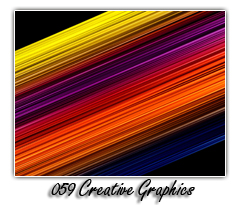
I've just uploaded a new slide show "059 creative graphics" to my site. It contains designs created with Apophysis software along with graphic elements built in CorelDraw and Photoshop. Third party filters and custom brushes were used.
40 megs
1920x1080 resolution
PTE Template by THEDOM
Greg Gordon

-
Colin -
I rather enjoyed this sequence. For the first time out re; PTE animation & PS work, you should be proud of this show. As you gain more experience in both programs, you'll gain confidence and probably get even more creative.
Greg
Linking Images Across Slides
in Suggestions for Next Versions
Posted
Dave -
Your link image zoom method worked fine - smooth.
Greg