

ContaxMan
-
Posts
630 -
Joined
-
Last visited
Posts posted by ContaxMan
-
-
Thanks.
Can you be more specific please ? I am using the french version and do not see any tool which would help me to know the distance (in inches, cm or pixels) there is between two points.
I have the English version of Elements 4 and it's not there either!
But there is a ruler (called the measure Tool) under the eyedropper in the full version of Photoshop.
-
Since I value this Forum so highly, I'm more than happy to help get rid of this rubbish.
-
Thanks for your comments gents - much appreciated. It's interesting that of over 100 people who have downloaded this show so far, only 2 here plus one other have bothered to offer any opinion.
In my mind when planning the show, I felt the names were very important because we don't know who they were! In a sense, what I'm getting at is that here was a tightly knit local group from whom a whole generation of young men were taken - for what?
The names I record are from THE history of the reserve - "The Wolds Wagoners - Ian Sumner" first published in 2000 by the Sledmere Estate. The list only includes confirmed names so who knows how many there were all together.
I hope that this show is a tribute to their bravery rahter than mere entertainment. It is not a "finished work". As I get more information and images, it will be revised.
-
That was quick Maureen! And useful too.
-
I see what you meen Ron in that case I would resize the with to 1024 and maintain aspect ratio to let the "drop work its self out". I think the 3:2 ratio looks better anyway, it has a more cinematic look than the near square 4:3. I found a 3:2 option on my camera and intend to use this format for sequences, so there!


An interesting discussion. As I work from scanned slides, the 3:2 ratio would be the norm but I find the empty strips at the top and bottom of the screen that are inevitable with this format rather distracting. So I nearly always crop but sometimes use Ron's cheat" of resizing the image without constraining proportions so that it ends up 4:3.
Just to add to the list of resizing software, if you look at help in PTE you'll find a link to a WnSoft free tool that works well. Odd that it isn't referenced on the WnSoft website!
-
On Beechbrook just now you can find my show (made with "standard version" of PTE) that tries to tell the story of "The Wolds Wagoners". They were a volunteer reserve drawn from the farms of the Yorkshire Wolds (in the East Riding of Yorkshire) who served their country in World War 1. The show tells the story with text, commentary, and images taken from the unique (and at one time controversial) monument to the Wagoners that stands in the village of Sledmere on the Yorkshire Wolds.
Any comments from viewers welcomed.
-
First of all, may I congratulate you on a wonderful set of photographs - lovely shots.
I hope you won't mind my making two comments about your show:
1. you should give the viewer more time to "take in" the picture. The slides changed so quickly that I couldn't appreciate each individual image.
2. mixing landscape and format slides "at random" doesn't really work as it is distracting to the eye. You might try grouping the images - a set of portrait-format images together, then landscape-format and so on. Or you could display two portrait-format images side by side on a neutral background so that the overall image shape remains landscape format.
But, once again, let me say how much I enjoyed the photographs. Well done.
-
Tom,
Having seen and heard it myself, I can vouch for Maureen & Robert's very compact sound system by Aego.

Following Maureen's recommendation I use the same system too. It works very well and is (fairly) portable compared to others I've seen.
-
Help - can someone please restore sobriety!
-
v4.48 is still very much alive in these parts.
In fact I'm doing lectures withing the next two weeks at two photo clubs introducing the software. As far as I'm concerned, it's still the "bee's knees".
-
Sounds just the job - I'll be lecturing on PTE at two photoclubs next month so this will make my life easier!
-
Anyone who searches for "The myth of 72" will find any number of clear explanations - here's one of the easiest:
-
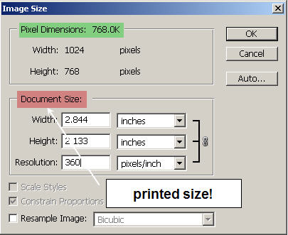
Photoshop tells us what we need to know. The pixels/inch is clearly labelled "Document Size". The projected image is not a document - vdu's and projectors display pixels!
Enough said?
-
I want my work to be more like a dream than a 'normal' film or video may be.
Well, Peter, I reckon you've been successful. Most of the shows I've seen with PTE 5 have been (understandably) demonstrations of the possibilities, whereas yours is the real thing.
Lovely photos (as always), matched to very well chosen music and your own inimitable verse.
My only adverse comment is that I'm not a fan of the text font you've used recently. It's too fancy for my taste and detracts from the images.
But a very minor irritation really - I'm just envious of your creative technique.
-
Yes - I agree with the above!
-
My guess is that Ron may be looking for some guidelines to include in his tutorials. I'd find these useful too, as it's hard to guess what an unknown system may be able to handle!
-
Russell Brown has recently posted two excellent movie tutorials on this very topic. Look for "Blue sky thinking" here:
-
But both methods take a lot of time, at least how I do the job.
That's the way it is, I'm afraid.
But here are some pointers:
1. use rough selections to outline the object - any tool: magic wand, magnetic & polygonal lasso, pen tool if it's a "graphic type" shape say a car or building, colour range, etc.
2. save the rough selection then use quick mask to refine it.
3. I prefer to work on the selection itself (loaded from the channels palette) and refine it using minimise/maximise filters, gaussian blur, etc to soften it.
4. a graphic tablet, e.g. wacom, is a huge help in all of this.
So to sum up -select roughly first then refine later. Keep the selection so that you can reload and edit it if you're not happy with the first result. Get used to working with masks and/or quick mask.
-
Thank you for sharing this show with us. I enjoyed your images a great deal and the music worked very well with them.
Two points about the show - to think about:
1. the title and end sequence is, to my mind, a little "over the top" - text effects used "because you can" which distract from the beauty of the actual subject. IMHO keep the title and credits plain and simple.
2. a number of the images could do with a little help from Photoshop's retouching tools. If they started out in a digital camera then the sensor may need some very judicious and careful cleaning. However, I spotted some hairs which may indicate scanned slides. Although it's only a small point, is worth remembering that the eye is drawn to areas of contrast in the image. Black spots & hairs on a fuzzy backgound are real eye magnets!
-
Lovely images, good music & all well-presented in v5!
Thanks for sharing this with us.
-
Assuming that you are using version 4 of PTE, then you can do a reasonable job by just using PTE object editior.
If you want guidance on this, send me a private message and I'll do you a "mini - tutorial".
You'll also find other PTE help on my club website below.
-
Although a Junior member I have been making Audio Visuals for over 30 years.
Great - you sound like just the kind of person we need here. I'll look forward to learning from your long experience as I'm sure that traditional techniques & approaches must have a great deal to offer the digital worker.
-
Both versions run fine on my new Dell Latitude D820 which has a NVidia Quadro NVS 110M.
-
I must say that your introduction certainly makes a grand entrance! Thanks for giving us access to the files so that we can see how it is achieved; this is most helpful.
New show on Beechbrook
in Slideshows & AV Shows
Posted
Thank you all for taking the time and trouble to view and comment on this AV. It's very helpful not to have to work in a vacuum.