Urmas
-
Posts
136 -
Joined
-
Last visited
-
Days Won
2
Everything posted by Urmas
-
I understand, that sometimes authors themselves are not aware about (telling) their own authorship when uploading images. We also know, that some social media sites strip all metadata from images and ... no more comments needed. Yes, it is sometimes too crazy world. As usual, it is all about finding the right balance. Thanks for interesting discussion and perhaps, world got a little bit better place after that. Sincerely, Urmas
-
Lin, I am sorry for you personal problems with WMG. My experience has one somewhat funny case. Some years ago one boy took (stole) my photo and submitted it on his behalf to some photo contest. When the photo reached the final stages, proof of authorship and original was required. Then the boy contacted me and asked if I would be kind to give him my photo so he could get his prize... I rejected his idea, gently. Tenzin Gyatso has said something like " By helping yourself you help whole mankind". I agree here - it all starts from ourselves. If each of us would act fairly, whole mankind would act fairly. If I want to use someone's photo under fair use, it can well be work of Annie Leibovitz, Helmut Newton, Don Gutotski etc. - there is no (money) problem with it until I credit the author. I have yet to witness a situation when there is a "orphaned photo of something" and I can not find even better one of the same/similar thing from credited author. In most cases we can just leave the unknown behind and use the credited one. By seeking and using uncredited material (photos) we are no better than those we complain about. Am I too idealistic? Urmas
-
Just Googled the "Google Books" and among the first resultst was this: Google Books Isn't Copyright Infringement. (To be fair, Binged "Google Books" as well and got this court case solution result on the first page also. Yandex and Yahoo "did not know" about this case yet ) So, for the moment, until the issue would have its outcome in Supreme Court, it seems, that Google has acted according to "Fair use". Regarding other Google activities we can have a debate elsewhere, if necessary at all. If you don't like Google, you may seek for win-win situation in the Apple World or Microsoft World or Linux World. Even they are somewhat mixed today. Being without computers and internet might also be the option, I know some such persons also. I know about the fair use of intellectual property and have used this practice myself. Giving always credit to the author! The Fair use is about (not) paying to the author. Fair use is not about disregarding authors at all. Maybe we here have been too serious about the Mur's problem. I have not seen his presentation and just got interested. So far it seems that he made it for personal use and could not find the right (internet) channel to show it to his friends. But even for the personal use, crediting the photos (videos, music) is always a good practice and habit. If you pay attention, you usually find the author's name. It just needs one extra step to record it.
-
I hardly think, that Google Street View is something complain about here in this topic. Street View is pretty useful when you plan to travel somewhere. Don't think about it as photography even the images are produced by cameras. Yes, the place where I live is there and I have no complaints about it. And if I intend to use their images as "fair use" I still note the source. As simple as that. I think we talk about images we get using Google search. Telling that somebody acts as bad (as we intend to be ourselves) is a lousy excuse. Marcus Aurelius said:"The best revenge is to be unlike him who performed the injury."
-
Mur, Google is not a photographer. All photos do have authors (orphan photos is a controversial issue). If the authors of the photos are as long dead as Chopin, you are free to use these images provided authors are noted. Depending on the country, copyright length is usually author's life +70 years or author's life +50 years. After that you are free to use intellectual property but still you have to note the author's name. For your own home use and private viewing, usually you can use in your slideshows you can ever get from the internet. If you go to public domain (and slideshowclub is a public domain) all copyright rules (including author's fees) apply to your "interpretation". In your case, if you do so, you might get away with it but you should not be surprised to receive some serious mails from lawyers. Urmas
-
Thanks for the understanding and support. Just to explain things a bit further. If it was a perfect world, where our images can contain all visible colors (DSLR raw-s are already pretty close), all our displays show all visible colors, all our projectors show all visible colors and all printed images reflect all visible colors - all our output devices can show all visible colors. (Probably using 16-bit Lab color model and some new printing technology.) Only in such perfect world we would not need color management. Because everything is correct by default. In reality with different devices and different image sources all having different color capabilities do not expect, that color management will make the same image look precisely the same on all output devices. No, that is not the case mostly. Yes, the reds are and still will be reds and blues are blues etc. But there are differences. What color management does? The color management engine knows both - the input image colors and the output device color capabilities. Now the input colors are "translated" into output device color space so that the relative intensity of colors is retained as close as possible. Tonal gradations are retained as close as possible. Color hues are retained as close as possible. And so the overall look of the image is presented as close as output device is capable of. Sometimes as close as possibe may mean a perfect match. Few case scenarios. The presented images have equal or smaller color gamut than that of the output devices. In this case color management makes all images look the same on all output devices. You will see sRGB images same on all calibrated sRGB or AdobeRGB (or larger) capable devices. You will see Adobe RGB images look the same on all Adobe RGB capable devices. And if you show the sRGB image on two displays, one having sRGB gamut and another Adobe RGB gamut, they still look the same. Without color management smaller gamut input color would be oversaturated on larger gamut output device. Those who switched from sRGB monitors to Adobe RGB monitors suddenly realised, that desktop icons got very "sparky" because desktop icons are not color managed.The presented images have larger color space than output decive has. Now the displayed image has different (absolute) colors on different devices with different gamuts, but color management takes care, that the image preceptual qualities are retained. Adobe RGB images do not look washed out on smaller gamut devices like they used to be without color management. And sRGB images would not look washed with projectors and displays having even smaller color gamut (plenty of them around).The output device has irregular color gamut. Again, color management knows it and makes best out of it. Without color manamegent, some colors look oversaturated, some are muddy.Lately Canon announced the development of very interesting projector. http://www.canon.com/news/2015/sep01e.html Probably it will initially have a price of the medium-sized car. But things look promising. When we will get color management right, we can start to wonder about presenting details where PTE engine is already very good . All the best, Urmas
-
In 2007 here in PTE forum I also stated, that calibrating projectors is of no use. What was 8 years ago? It was the time, when Apple reduced price of Cinema Display (sRGB gamut) and made it available at reasonable price (also for PC users). I recall many photographers buying it then. And we started to get better results than before. However, there were only handful good quality projectors in production and their price was out of thinking and reach not only for personal use but for most organisations. First time I saw my digital images presented quite accurately (yes, all sRGB!), was during Fürstenfeld festival in Germany (2007) with the projector having the cost of a medium-sized car. And it wasn't a rare sight to see slides being projected in old-fashioned way. We have seen quite a bit of development in imaging technology within last 8 years. Fingers crossed and waiting. Urmas
-
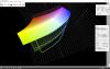
The sRGB advice in reality is a game of probabilities, more of like gambling. In exceptional cases you might hit the second price, usually you lose. It is quite a funny myth, that (good) sRGB gamut is default everywhere. Actually in practice I have yet to see a projector with precise uniform gamut. As an example, see the attached file. It compares sRGB gamut (wireframe) with the gamut of my reasonably-priced projector (solid). It is already discontinued Canon LV8320 in cinema mode. That's the price-perfomance ratio I could afford few years ago. Could not rely on projectors usually available in random lecture rooms. Still goes strong and has reasonable image quality. The gamut of that projector is not uniform. It can show much more yellows and slightly more blues than sRGB gamut. But less greens and reds. It is quite typical scenario for LCD-projectors. Have calibrated three different projectors (more advanced from also Canon and one from Epson). Different gamuts, but similar pattern. So, if you throw sRGB image in not-color-managed way to not-uniform-gamut projector, it shows oversaturated yellows-blues and so-so greens-reds. But what if you are showing a presentation where yellow is very important? At the moment I get better results with that particular projector when I use Adobe RGB images instead of sRGB images in PicturestoExe slideshows. Neither is perfect. Only color-managed workflow can handle such situations and get the most out of it. In real life - the worse and less uniform your projector/display is, the more you need a color-managed workflow and benefit from it.
-
Ken, Downloaded your photos. Looked at them on my monitor. Checked histogram and numbers. Here are the results of my little investigation: 1) Neither of your photos has a color profile. Since they are made with compact camera, probably out-of-camera jpg-s, I assumed sRGB. When you use images without color tag in presentations or simply view them on different computers, results are always different. If you look them on Adobe RGB capable monitor, colors are oversaturated. In photo editing softare, however you can always assign proper color profile before showing the image. Upside-down photo 1) White t-shirts are mostly blown-out. The numbers show 255-255-255 in all channels. Because of clipping in all channels this area actually does not have color information and also details are lost. You may only quess the color. It does not matter, if you present it on display (TV-s have often overhelming dynamic contrast) with too much contrast, you will see blown-out area as white on any display. 2) White t-shirts around blown-out areas show slight blue cast what is normal since the pilot (?) wears blue shirt and blue color from it reflects on white surfaces. Photo with a plane and three men in front of it. 1) It is underexposured because white is not while but more like light grey. That is typical scenario when autoexposure is used to photograph bright subjects. Next time your daughter needs to dial in an exposure compensation. 2) Photo has incorrect white balance settings and hence the white is not white but actually has quite obvious blue cast. Again, auto white balance settings in compact cameras often result incorrect values. RGB numbers on plane tail: R: 208; G: 223; B: 230. If the plain is white, the numbers should be the same or very close. 3) "White" T-shirt colors from left to right: R: 205; G: 206; B: 224 * R: 202; G: 207; B: 227 * R: 208; G: 215; B: 233. For the boys some blue cast on shirts is normal again because they wear blue jackets. On your t-shirt it should be much less. But again, it is because of incorrect white balance. That tells the story. Judy Kay, morturn, PGA and many others In my photographic lectures I often ask the audience, who works behind calibrated professional grade monitor. In best case scenario 1 out of 30 raises hand. Usually none. If I explain what it means, show how it is done and compare the results before and after, everybody understands. It is probably true, that majority of people who take photographs (as hobby) and present them to others, do not know, do not understand and do not care about color management. Judging from the discussions here it seems, that among PTE users the ratio 1 out of 30 is quite similar or even less. Color management is something, that can be applied and used easily. It is not a rocket science. And once you see the results, there is no way back. There are numerous features requested by many users I personally find unnecessary or I have the workaround using other pieces of dedicated software for image, video and sound editing. However, I never complain about such requests because I also try to understand the reasons behind it. And If Igor and his team has resources to implement it, let it be. It is usual, that we use mostly around 10% of particular software features. Color management is something, that has no workaround or alternative. Having color-managed image editor and calibrated display/projector do not help with not color managed slideshow software. If there are people not willing or are afraid to learn new useful tricks. God bless them. But it should be also fair to expect them not to try to cut wings of those, who would like to fly. Urmas
-
Grayscale is also a part of all color gamuts. You have brightness, but hue and saturation are 0. If colors are off, that's the problem. If grayscale is little off, that's the BIG problem . Urmas
-
Just look within the same thread, Peter Posted Yesterday, 08:33 AM a sample exe demonstrating how colors are off when using PTE. I also see no reason to go on with the dialogue here. If you can live without color management (or do not know how and where to use it yet(?)), good luck to you. Ii's not my problem. But why are you trying to spoil the party for those, who understand the topic? Wouldn't it be wise to accept, that there might be other well founded opinions and experience? And learn from that. Igor understood the importance of color management very quickly and was able to make the color aware test pice of software within hours. Really well done and high level of expertise! (As a side product I have nice simple piece of software to demonstrate importance of color management in my lectures.) I am not alone who waits eagerly for the implementation of color management into next version of PTE. That's should be the priority No 1.Or shold I use the term MUST. Each color-aware software has also an option to turn off (or not to use) color management, We disussed it with Igor also in PTE forum, that PTE probably should have such option as well. So, when the color awareness is made available in PTE, you can go on with your own workflow and I (and other color-aware users) can use color-managed workflow. So, nobody will get hurt and everybody will be happy. Complete win-win situation. Urmas
-
I do not remember such concent about calibration here. A link would be helpful. If calibration using calibrator is unnecessary, tell then, why for example Eizo has different opinion on that? http://www.eizoglobal.com/library/management/management/02.html
-
Ken, You might be the second person I know who as absolute color vision (like absolute hearing in some musicians). If you are happy with your results, I am happy also. I am not that capable. I have yet to see a monitor whith linear tone curve, that setting one color accurate makes everything else accurate as well. Usually profiles I get after hardware calibration are nonlinear. And I have yet to see a monitor what has 100% accurate colors out of box, Even those, where producer claims so, are always better after hardware calibration. sometimes differnces are small, sometimes bigger. That's normal, since video card may play it's role as well. I still strongly suggest hardware calibration for both - monitor and projector. The device costs about 1.5 times the PTE Deluxe licence and is many times less that Adobe Photoshop or Sony Vegas. Or compared to camera- it is like cheapest compact camera. Well spent money. Urmas
-
Ken, Proofing monitor using paterns and images on webpage is better than nothing but insufficient for proper results. The webpage you pointed, does not have even color profiles atached to their sample images. While greyscale images are so-so, the color test image is far from reality because of missing color profiles. For further reading here is the introduction of calibration: http://www.cambridgeincolour.com/tutorials/monitor-calibration.htm Urmas
-
Basically, your RGB (most used color model) image has a color profile tag defining actual colors because RGB is a relative color model, depending on color profile (say sRGB or Adobe RGB) same RGB numbers say R: 50 G:120 B:80 result in different color. Your output device, in our case a display or projector has its capabilities. The best are usually around 100% Adobe RGB and then there are others. Even the factory calibrated displays and projectors need hardware-based calibration (X-rite for example makes calibrators) to precisely know its capabilities and create profile for the device. You calibrate the system basically starting from video card and ending with display panel..The same display/projector may behave differently with different inputs from different video cards. And for the projector, its color reproduction also depends on screen material, room (wall and ceiling) colors, room lightness etc. Usually white balance needs adjstments and calibration takes care of it as well. Now the color aware software in between knows the input file color values and knows the output device profile and now translates the colors the best possible and predictable way. You can use different color gamuts in your input files, but they are shown correctly in case of output device has same or larger color gamut. If output device has smaller color gamut, all images will bee shown similar. That's the basics. More profound explanation is here http://www.color-management-guide.com/color-management-summary.html. You can also google "color management". To illustrate the capabilities of different devices I attach a comparison of two devices. Wireframe is a computer display having nearly 101% of Adobe RGB gamut. Solid is my reasonably priced projector I bought few years ago to get predictable results when having presentations on the road. These gamuts are results of actual calibrationd made with i1 Display Pro. Edit: Somehow could not attatch the file here so had to upload the illustration to Google Drive: https://drive.google.com/open?id=0B7Wqj0nElbxfLUNFTkt2NXpOX3M
-
Lin, Most modern browsers are already color managed (http://www.color-management-guide.com/web-browser-color-management.html). Regarding displays and projectors (hardware) I agree, that most (used in simple office work) are not even sRGB capable and most of them are not calibrated. However, I suspect, that you would not like to use such monitors in you own workflow when preparing photos and presentations. And I also susupect that you would not like to use such projectors to show presentations to the audience :-). 100% Adobe RGB capable displays and projectors are here and most professionals (Except Retina display users) use them. Urmas
-
To convince specially you, I need to know how is/isn't your photographic workflow organised and color managed (software, harwdare). I disagree that it is of least importance in PTE develpment. In fact, it is the last single piece of software in my workflow what is not color managed. And that is a problem. Color management is not about what has greater visual impact in randomly (un)organised conditions. Color managment is about to get predictable results in controlled and properly organised workflow. When you know what is going to happen with you images on the screen, then you will be able to provide always the best possible visual impact to the audience. In your test sequence odd numbers display correct color, even number are oversaturated on my calibrated 100% Adobe RGB space. Urmas
-
Next version is also a future version. Hopefully. Igor actually understood and solved (in test app) the problem very quickly. Don't think that implementing it will be too hard pressure anymore. I suspect, we'll get the answer quite soon.
-
Brian, If your monitor is "wide gamut" monitor, then make sure, you use newer calibrators, designed to cope with "wide gamut". It is not complete disaster, when you use older models, but it is better to be on safe side. I personally use X-Rite i1 Display Pro with excellent results both - display and projector. Before calibration set your monitor to settings, where full capabilities are under your control. There is little sence to calibrate monitor using "sRGB" or "aRGB" presets. Usually "custom" or something settings give you the necessary freedom. Read your monitor manual for that. Only if you can provide constant working environment (constant light in the room), the using ambient light correction is reasonable. Usually light conditions change so much that it is actually easier to have you monitor as calibrated etalon. And last not least, Do not hope, that calibration makes your monitor displaying everything. Calibration does not make your monitor gamut larger. It simply helps to set gamma, white balance and correct color casts and some other image irregularities. Calibrated monitor enables you to see the best picture your monitor hardware is capable. And second, resulting profile helps the operating system use the most of your monitor capabilities when used in color managed workflow. If you want to match images on different monitors after calibration, these different monitors must have the same hardware capabilities. There is no way to make images look exactly the same on cheap TN office display and professional grade wide gamut monitor. But they wil be much more similar than before calibration. So, good luck! Once you get it right, there is no way back. Might take some time, If you have no previous experience, but the time is well spent.
-
Daniel, Time will tell. Just my real life experience from printing world (but similar issue). When I prepare my images to print and I want them to be as good as possible, I ask for CMYK settings from the publisher and do resampling, output sharpening and CMYK conversion myself. Once (years ago), there was a publisher, who answered to my CMYK profile request, that they don't know. Finally they revealed, that they have just default color settings in publishing software. Actually they used US ink and paper settings in prepress software to print in Eurocoat environment. When the publication was printed, they went to printing house, stood aside the printer and asked the printer to adjust the inks in order to get output they were finally satisfied. Luckily for them, they survived but in order to do so, they had to learn and implement color management. Urmas
-
The club situation you describe, is actually good example of mess what happens in the imaging world without color management. Yes, you have to educate people to take advantage. The cost for learning and starting to use color management is reasonably small but the benefits are far more advantageous. The day you show first properly color managed slideshow in your club, will be the turning point. As a general remark, videos are not that good in terms of color handling because to decrease file size much of the information has to be compressed and color information is usually truncated as well. Therefore, to show PTE slideshows with majority of photographic images the PTE exe is and will remain preferable. Good video editing software is also color managed and rendered videos can have colors resembling sRGB or Adobe RGB space. If you incorporate videos to PTE slideshows, taking this into account will help in color managed workflow. To show only videos, freeware video player called Media Player Classic is color managed and does very good job. A good starting resource is here: Color management guide
-
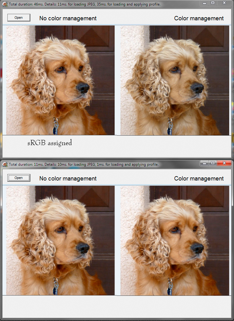
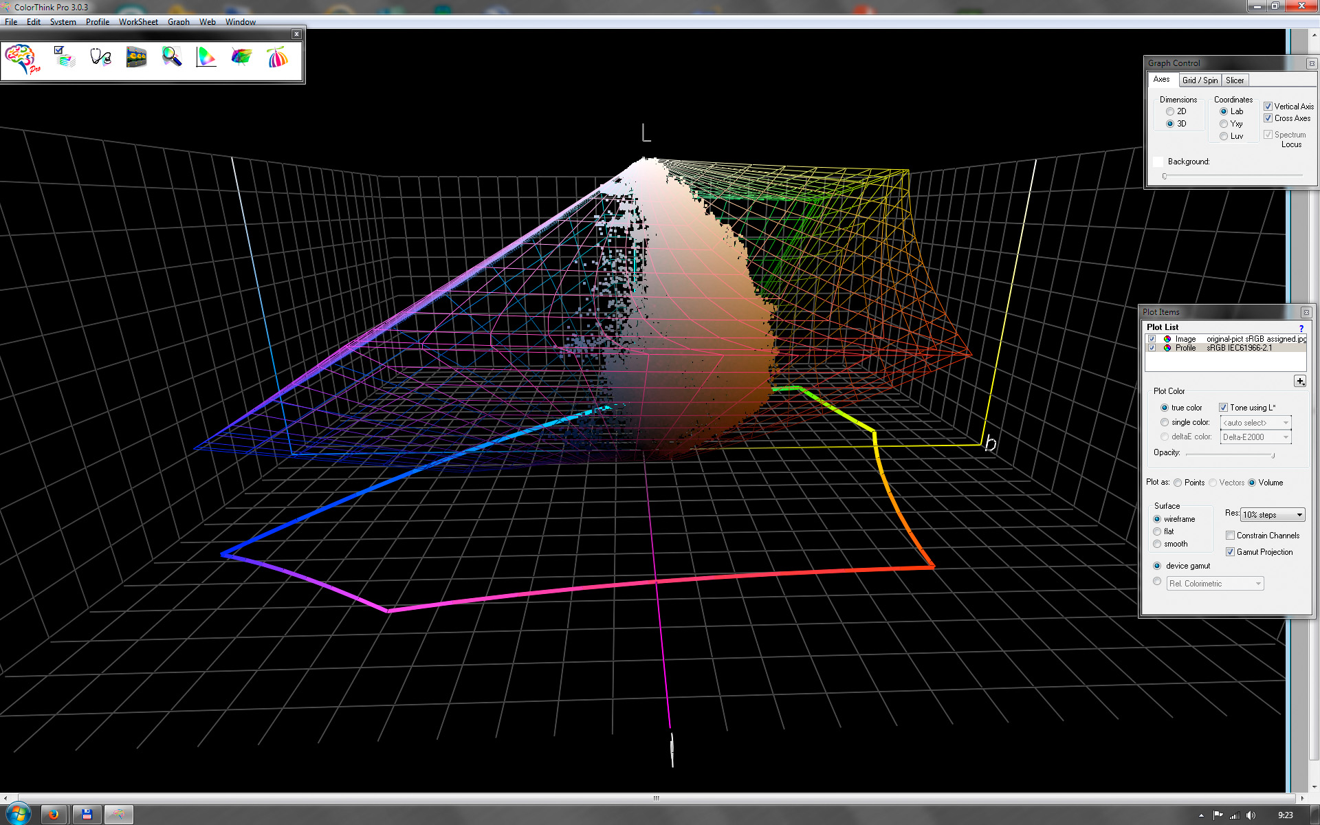
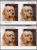
Picsel, Just had another thought over your results and actually replicated your results. It seems, that your wide gamut monitor has correct profile assigned and both test programs, Igor made, understood it correctly. You actually used dog image with sRGB profile to test color management. However, when you uploaded your sample image to the forum, you reworked it in Photoshop and saved without color profile. Here is my test protocol and results I made a copy of your dog image and assigned sRGB profile to it. I assigned sRGB because when I looked your website, I noticed most photos made with compact camera (http://www.baladesetjardinsdusud.1cd5.com/). Compact cameras usually output photos in sRGB space. 1) When I used dog image with sRGB profile assigned, my results were exactly the same as yours. See "Dog test.jpg". Upper pair is image with sRGB profile assigned, lower pair has no profile. 2) Then I opened these images in Photoshop. Image without color profile is not color magnaged. sRGB image is color managed. And the results are exactly the same, as with Igor's test program. See "Dog test PS.jpg". 3) Just for curiosity I opened sRGB dog image with ColorThink Pro and compared its colors with sRGB space. See "ColorThink sRGB.jpg". Wireframe represents sRGB color space and dots are actual pixel values of dog image. As you can see, majority of the colors are well inside the sRGB space. That's logical, because melanin as color pigment in animals, can't have vivid colors like some flowers, fungi or insects may sometimes have. Conclusions 1) Both color management test programs Igor made, actually work correctly. Both are good, side side by side comparison is more self-explanatory. third version shows the names of the profiles. Also good feedback. 2) In order to benefit from color managed workflow, always take care, that images have correct profiles are embedded. 3) The color management did not give you a bad results, actually you could see your dog correct colors. 4) It is common, that humans tend to appreciate vivid colors more than pale colors. However, oversaturated wrong colors are bad. The dog is not a purple emperor (flashy butterfly). The world is full of different objects and different colors. And color management actually enables us to show the differences we wouldn't see without it.


-
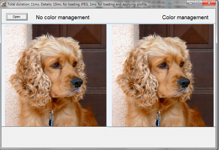
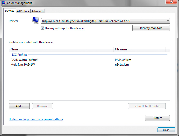
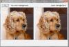
Downloaded the original image and it does not have any color profile associated. So, the color management does not have any clue how to treat colors. Probably Windows color engine treats images without profiles as being in target space because on my monitor your dog image without profile is exactly the same in not managed and managed states. In both test versions 2 and 3. Please note, that now the jpg has sRGB profile embedded (see attached image of version 2 comparison). There is something wrong in your workflow what creates image without color profile embedded. And you system color management needs adjustment. See another attached file how color management tab in Windows 7 should look, when device profile is associated to the monitor. You see clearly monitor model (it means you have dedicated driver, not generic one) and default profile for it. The default icm profile was created after calibration the monitor with i1Display Pro. The lower profile file came with monitor software. It is OK, but calibration result is more accurate. Depending your OS, you might have different menus, but the basic idea is the same.

-
Just have to correct one my previous statement about png and BMP images: Actually, both, png and bmp images can include color profile information. Good news. So, most image formats PTE supports, can be used in color managed workflow. Only gif seems to be the black sheep in the cattle.
-
Sure, video world needs to mature a bit in his standards. on the other hand, video world is not that much color aware as photography. Just consider all kind of color grading and all kind of compression going on in film industry. If I need to use video clips in otherwise Adobe RGB slideshow, I can always edit them to look good in Adobe RGB color space. Afterall, if you handle output pixel profiles, all pixels will be color managed the same way, both from image and video (or text) objects. So, I see no real problems with videos. PTE is not a replacement for dedicated video production software. Photographic images and their correct display is far more important in PTE slideshows. And PTE slideshow as exe file will always give better results than the same slideshows converted to some video format. Maybe sometimes in future, when we do not need as much compression and color truncation in videos as we need today, video world for sure will adopt sRGB/AdobeRGB/someotherRGB space. That's logical. Once again, Igor, thank you for taking the matter seriously. Good day just got better.