

Aleina Show
-
Posts
216 -
Joined
-
Last visited
-
Days Won
8
Posts posted by Aleina Show
-
-
A little experiment. This transition can be downloaded from my website.
http://aleina-show.ru/skachat/stili-dlya-pte-av-studio
Best regards,
Aleina
-
George,
Thank you very much for your practical outlook on the job. I will try to answer your questions.
Yes, I think that using the same project for 2 years in a row is not the best option. But the same opinion can apply to most finished projects. There are universal styles that we can apply in any project. But they are usually boring for children. But you gave me a good idea to think about. I could create animation sets separately so you can change them in different projects as you wish.
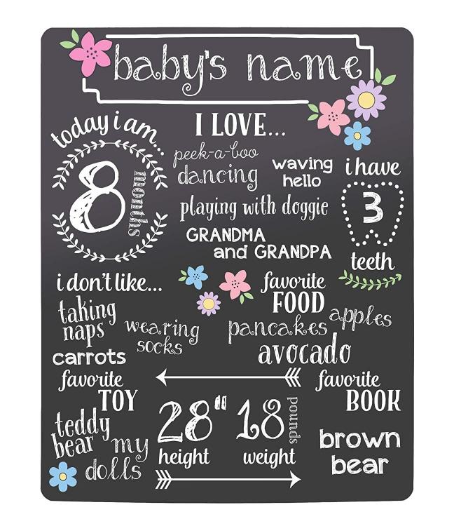
As for text layers. Initially, the project was planned as a metric in which it was possible to fix the most important features of the child. What he loves or does not love, what he knows how to do. He waves his hand on "goodbye," slams the closet doors, etc. Some details of his grandparents may not know. What can you ask your child's parents about?
I was inspired by graphical examples of metrics on the Internet. And the original work in After Effects. You can look at it, maybe some texts from there will suit you.
https://videohive.net/item/family-memories-baby-photo-album/13709995
In addition, you can use decorative letters with pictures instead of letters. For example, such
http://ru.legionfonts.com/fonts/atman-dings
https://good-surf.ru/forum/index.php?id=1181000
You can use any images instead of text, for example, icons, flowers, hearts, cars. It all depends on your imagination.
I tried to make editing this complex project as simple as possible. On Igor’s advice, I made all the layers “non-clickable”, except for those that require editing. And this is text and photo. In most cases, you will only need to click on the screen in the "objects and animations" to select the desired text layers and layers with photos. This way you can easily find text areas. And if any of them seems redundant to you, you can remove them.
The project has a small video tutorial on editing the project with English subtitles.
Best regards,
Aleina
-
That's cool! Thank you, Dom! And I racked my brain how to make transparent text with a stroke.
Best regards,
Aleina/
-
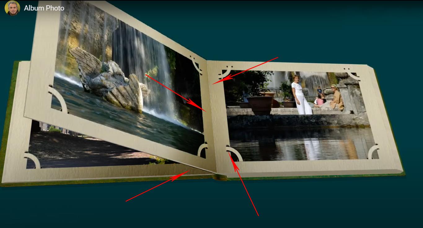
This is a very beautiful album. Excellent made flipping effect and page thickness. Bravo!
I have a small suggestion to add some shadows. I think that with shadows your album will become more realistic.
I added some shadows to Photoshop and showed where. In the middle of the book. Under the flipped page. And under the photo mounts.And I think that it would be better to slightly increase the speed of appearance of photos on the last 2 pages.
It will be a beautiful style!Best regards,
Aleina

-
8 hours ago, Tonton Bruno said:
Some time ago, I started to work on a project for a more realistic album.
I liked your option, it turns out realistic, the pages are voluminous, cardboard. And did you manage to make it so that when you turn over the number of pages on the left increases and decreases on the right? I also want to see your result.
4 hours ago, Tauratinzwe said:For interesting and realistic slots in the page to hold the images, check out the PS actions at PanosFX.com. Panos has a set of actions that give a variety of slots. A few examples:
This is an interesting suggestion, thanks!
-
27 minutes ago, thedom said:
That’s the option I choosed for my photo album and I had no comment about it, probably meaning it is acceptable.
Yes, I noticed that too. It’s a good option.
-
This is a cool parallax! It looks very pretty! I really like that you are constantly working to improve your styles. Sometimes I think it's already impossible to do it even better, but here you have a new version coming out! And it is even more beautiful!
-
6 minutes ago, JRR said:
My comment re adding thickness as the pages turn was made as my being very picky.
It is right. If we do not strive for excellence, we will not have professional growth. I am also a perfectionist. And I always appreciate such advice.
-
wideangle, nelson, stranger2156, JRR
Thanks for your feedback! Thanks to you, I can look at my work from the other side and find its strengths and weaknesses, and I already have several ideas for improving the template. Thank you all very much!
4 hours ago, stranger2156 said:In the demonstration of the presentation of the book, I agree, there you can hone every detail to infinity. In this case, in my opinion, it would be enough to open the book “in the middle”, with approximately the same stacks on both sides.
That is a good idea, Paul! It is technically very interesting to create a “real book”, but I understand that sometimes the result is not worth such a big effort. Your option deserves attention.
4 hours ago, stranger2156 said:As for the shadows ... in my opinion, they are a bit sharp at the junction of the pages, and when I open the pages, I would make them a little softer. I think this would give a better perception of the whole picture.
Thank you for your opinion. I will still work on the shadows.
-
19 hours ago, thedom said:
I tried to change things to be enjoyable for everybody
It looks great! The movements are softer. And the inscriptions look very harmoniously and decorate the photographs.
-
thedom, wideangle
Thank you very much for your feedback and suggestions for improving my work! I am very grateful to you!
12 hours ago, thedom said:do not use “curved” ill image for the pages on the left
Thanks for the advice, I think it can really improve visual perception.
12 hours ago, thedom said:try to fix the little glitch in the middle of the book when camera goes on the left side of the book
So far I do not know what to do with this problem. There is a transition at this place. Previously, the glitch was much stronger. I completely redid the book 2 times because of this glitch. But later I want to completely redo the concept of the book in order to reduce the number of layers with shadows in which I got confused. My first book is a little defective. I did not have enough experience.
12 hours ago, thedom said:- try to soften some movements of the camera, some of them are a little bit abrupt sometimes
- if it’s possible to add more variety in the angles of camera, it would be niceI completely agree with these proposals and will definitely work on these improvements.
12 hours ago, thedom said:Do you work in the kids sector ?
No, I do not work in the kids sector. My tendency to create childish templates is related to my desire for animation. It is in children's templates that there is a wide scope of application of my interests.
3 hours ago, wideangle said:The decision for you is how much focus you want to put on the animations, compared to the actual photos. Like JRR, I found myself looking more at all the animations and missing the photo details sometimes. Whether you want larger photos and fewer animations is, I guess, a personal choice.
Thank you very much for your kind words! I understand that animation distracts a lot of attention. And I always have to make this difficult choice. Animation or photos? How difficult it is when you love both of these things equally. But my opinion is inclined towards animation precisely in children's works. Since children are more interested in looking at what is happening around them, rather than looking at their own photos. And the kids have great reactions to my animated templates. Of course, I would like it to look nice to adults as well.
-
mhwarner, JRR
Thanks for your feedback and for the suggestions for improving the work. Your opinion is very important to me.
22 minutes ago, JRR said:Perhaps a little less bounce??
Quite possible. It is always difficult for me to maintain balance with my love for the animation of everything that I see.
") I will definitely consider your opinion in the following works.
25 minutes ago, JRR said:
I will definitely consider your opinion in the following works.
25 minutes ago, JRR said:Is there a way to add thickness to the left and subtract thickness on the right?
I think it's possible. But for this you need a little more experience in working with the program than I have. Your idea is great and I will try to make such an effect.
Best regards,
Aleina
-
I think all PTE AV users are trying to make a book in this program! So I decided to make a children's album. I was inspired by the After Effects template. But since I myself drew clipart and made animations, fantasy sometimes led me aside.
I worked on this template for 3 weeks. Making the book in the program turned out to be more difficult than I expected. The hardest part was working with reflections and shadows. In each slide, I had too many layers with shadows and I got confused in them. Animation of animals I did in another program. Unfortunately, PTE AB does not support looped footage. And I did not do footages with an alpha channel for 20 seconds, since their size is simply huge. The same applies to footage with black and white masks. I preferred gif animation. It was rather difficult to calculate the duration of the GIF file so that it did not twitch at the moment of slide transition. Since the end of one slide is repeated at the beginning of another. The gif file has to be duplicated.I will be grateful for your feedback.
Best regards,
Aleina
-
Paul, thanks! Your style may be suitable for widespread use. It's very helpful!
Best regards,
Aleina
-
On 6/5/2020 at 12:22 PM, thedom said:
As my last productions, I tried to make something realistic.
This is a real pleasure! Beautiful and aesthetic styles. I look and just enjoy it, because everything is fine with my vestibular apparatus. I prefer dynamic work and I don’t really like when one photograph floats before my eyes for a long time. And in this situation, the speed of showing photos completely suits me.
Aleina
-
Very nice transition. Thanks Tom!
Aleina
-
Thanks for the great idea for experimenting, MUR!
Aleina
-
Beautiful embodiment of the idea! You are great at creating 3D models in PTE!
Aleina
-
I fully support the creation of this topic. And I agree with the proposals of thedom.
Aleina
-
Dom,
this is a great implementation of shadows and reflections in your work! Thanks for the screenshots, it is very nice to see everything in close-up. I'm waiting for the finished result!
Aleina.
-
MUR
You are well done! Flowers have acquired the necessary volume, the base of the buds looks neat.
I agree with the suggestions of the Dom's regarding the diversity of the appearance of the leaves, making them slightly different. Size, shift in Z, blur and color correction. And imitate the shade of flowers on the leaves.And I fully support the idea of creating such a thematic section on the forum.
Aleina.
-
Lin,
this is a very good style and very useful. Users can understand how to make curved pages using this style as an example. Thanks for the demo!
Aleina
-
thedom
It turned out very impressive! The book is like real! I really like your approach to creativity. You do not just apply technical skills when working with the program. You are more an artist. You can clearly see where and how to apply shadows, highlights and other nuances to make the effect as realistic as possible. Bravo!
Aleina
-
thedom,
as always, it's beautiful and surprisingly realistic! I would like to more and more seriously study the capabilities of the program, looking at it.
Aleina.
Birthday candles
in Work in Progress
Posted
It looks very pretty! The flame of candles looks natural. You can make the dark center (wick) a little more noticeable. This is another beautiful idea!