
Lin Evans
-
Posts
8,206 -
Joined
-
Last visited
-
Days Won
12
Everything posted by Lin Evans
-
Hi Ron, Just go to the "Properties" tab from the Objects and Animation tab and change the name from "Image1", etc., to reflect something meaningful - even the real file name. Best regards, Lin
-
Hi Robert, I really enjoyed the mood and aesthetics of this which very well matched the beautiful nature of the Utah landscape to the the background music. There was one point where I'm not certain, thinking back, whether I would keep the abrupt stop, however. Consistency can be alluring whether expressed as perpetual slow pans and zooms or simply stills with appropriate transitions. Change can certainly be used as an aesthetic "punctuation," but I'm still certain whether I like it in that particular place. One of the things which Igor will implement in the release, I think, is the rather nice feature of linear acceleration and deceleration so that it will be possible to have smoother transitions from movement to stills without the apparent "jerk" presently requiring one to necessarily overlap fades between frame changes. There are times when it would be really nice to smoothly pause motion and freeze on a particular frame then "slowly" resume the motion. I've found that I can use opacity levels and gaussian blur as a "masking" mechanism, but it would be nice to not have resort to this to effect smoother changes in the transition from still to movement and back. Very nice presentation! Best regards, Lin
-
See Jean-Pierre's (JPD) tutorial on Objects - go here: http://www.picturestoexe.com/forums/index....&hl=Jean-Pierre Lin
-
Actually, I can't take any credit for any of these great ideas - TheDom came up with the very innovative idea and Al Robbins took it one step further. I only implemented it as I had learned from their examples. I don't have a lot of "creative" talent when it comes to these innovations, but rather a well developed sense of implementation. When someone with creative talent comes up with and idea that we can all learn from such as your very smooth implementation of the "drop letters" I'm always amazed because my mind just doesn't work that way - I wish it did! Best regards, Lin
-
Cool!! I like it. Lin
-
Let me expand a little on Al's suggestion. In case you haven't done this before, here's how you proceed. Open a new file in PhotoShop and be sure you have it set for Transparency rather than "white" or "background color". You should see a checkerboard pattern if the file is set to transparency. Choose the "text" tool and set your opacity to 100%, choose your font size and color then type in your letter, word or sentence, etc. If you wish to apply special effects to the text such as drop shadows, etc., highlight the text then bring up your "Layers" box and click on the small round icon (add a layer style) located at the bottom left of the group of icons. You can experiment and see the effects you can create with the text. Once you have it looking like you want then crop excess "checkerboard" away and save it as a PNG file. This file then can be used as an "object" and can be manipulated just as any other "image" with all effects possible with the graphical engine. Lin
-
Hi Ron, Definitely "easier" if the road goes somewhat in a straight direction, but as I explained on the other post, you "can" work around the turns by either using several smaller "road" rectangles or a red "dot" (or square) slightly larger than the width of the road which can negotiate the turns to be followed by a red rectangle to "keep" the paint while the dot is moved to subsequent problem areas. Best regards, Lin
-
Hi Ron, Actually, you are correct that having multiple changes in direction "may" need additional layers of "road" but it's not really all that difficult to do. Unless there is a rather abrupt and reasonably lengthy change in direction, a single layer between the main map and the png route "cut out" will suffice. Depending on the individual circumstances either two or more small rectangles or a transparent mask with a red "dot" slightly larger than the cutout width of the road will work nicely to make the "turns". If you remember TheDom's early little red airplane was "followed" by the red layer so it appeared that it was a single red line streaming out behind the airplane. The airplane was on the top layer with the red "road" rectangle one layer beneath. You could do it that way, but easier, I think, to use a red "dot" to lead the sharp turns then on the time line after the red dot paints the turn you bring up a red rectangle to "keep" the road paint while the dot goes on to the next place it's needed. It's not as elegant as doing it with a single red layer on a road which has a primary direction, but is a way of getting around the issues of making abrupt changes of direction smoothly. Best regards, Lin
-
Hi Al, I see that now that I've looked at the code. I actually created a similar roadmap (posted on the p2e link) and did use a couple black rectangles to mask the red to prevent splash over at the bottom and top of my screen. I probably should have just been more careful in the construction of the red layer but threw it together pretty quickly so didn't resize but just made it the same as the maps. Had I not ended up so near the bottom border it wouldn't have needed any masking but I ran the red over a tad so just used a black opaque bar in a layer over the edge at the bottom and a large black rectangle with a transparent rectangular center to mask the other edges. I think as long as there are no 90 degree or greater turns, the feathered edge works great. I suppose it would be just as easy to do about a 10 pixel feather all the way around the rectangle. It's more difficult to "map" the little red circle idea, but it does give some flexibility for making really tight turns. Very nice job you did on that by the way! Best regards, Lin
-
I really liked TheDom and Al Robbin's "roadmap" samples, so thought I might create one of my own usnig similar techniques. Essentially done in the same way except I did use a couple black "masks" to prevent red splash over from my red rectangle. One is a "hollow" mask with a transparent rectangle for a center and a black border to hide any red overlay which got beyond the borders. It would have probably been more "elegant" to make the rectangle smaller rather than having to mask it with black rectangles, but it was quicker to just put a couple black bars in a layer over the red at the top and bottom of the frame. The only thing I really did differently was to add a white and blue "tip" on the red "road paint" leading edge (as in USA map - red, white, blue) - actually just playing around. Otherwise just use of transparent background png's images and text blocks. Two links below. The first, "cimarron.zip" is the zipped files and pte so you can see how it was done if you wish. The second "cimarronexeonly.zip" is the zipped executable only. http://www.lin-evans.net/p2e/cimarron.zip http://www.lin-evans.net/p2e/cimarronexeonly.zip And a little "fancier" version - zipped exe only: http://www.lin-evans.net/p2e/denvertocemarron.zip Best regards, Lin
-
Yes because they are grouped but it's "relative" whether you move the two maps over the red layer or move the red layer between the two maps. I think either way could work but when the road changes general direction such as a right angle turn or even going backward a bit, it may take an additional red layer to keep the appearance. Also you might have to actually "rotate" one of the red layers to keep everything looking correct. Another way to approach this is to have a small, red opaque "circle" mask in a transparent background png which would "trace" the actual route and would be followed with larger red rectangles which "keep" the red paint behind the red circle. The small circle would let you make the turns without accidentally "painting" adjacent areas and you wouldn't need to "rotate" the red layer to make 90 degree turns look correct. Best regards, Lin
-
LOL - You're working too hard Igor. Think of it as three objects each on separate layer. The PNG is the main map on top with just the actual route being transparent. On the bottom is the jpg original map. These two layers lie in perfect alignment and are grouped so that whatever happens to one happens to the other. The red layer is set to move between the two like the contents of a sandwitch and set with keypoints to "slide" down the route. Because the png map overlays the original map it "appears" as if it is a "solid" map but actually the "cut out" transparent area overlays the "real" map" so that it "appears" as the original which shows through the cut. When the red layer is moved in between the two, it actually appears to follow the route. The black background is just to keep any "splash" over off the screen in the case when the two maps are being moved. I "think" this is about it. Best regards, Lin
-
Hi all, I will definitely zip them up and post them but I do have to wait until I can clean off some space on my server. Between the two shows the file size will be close to 200 megabytes and I'm presently running very close to my limits for storage on my isp agreement. I would like to also "end" the p2e show rather than have it loop as present and I think Igor has that as a feature in Beta 3 which should be out in a short time so as soon as he releases beta 3 I'll re compile the show and zip both up and load them on the server. I tried to minimize the differences in pan & zoom, etc., by attempting to keep the file sequences as close as I could from memory but there are some slight changes in the P2E iteration and a couple additional slides. Some things which took multiple copies of a slide with PSG were easily done on the same image with P2E but the actual number of slides was very close. I also used some effects such as gaussian blur, transparent background PNG text etc, and such in some places on the P2E show which I couldn't do with PSG but the essential theme is the same and I did include all image in the P2E show in as close to the same order as I did with the PSG show. The things which were immediately apparent were the smoothness of the pans on large panos and the quite evident increase in resolution on images which were high resolution. Most of my pano shots contain mountain ridges which quickly reveal losses in resolution caused by the interpolation to get back the screen size with PSG. It's not that the PSG show is bad, in fact it's very good. It's just that the P2E is that much better from a photographer's perspective. Once made into a DVD format I doubt that anyone will be able to see any relevant differences since the resolution losses going to DVD resolution are unavoidable. On the other hand when displaying with an LCD projector, etc., or when displaying from a computer on high definition plasma TV screens we will see huge differences. If I can clean off enough files this week, perhaps I can get them up by the weekend but I need to evaluate what I'm removing since much of it is forum linked on a number of different photo forums. Best regards, Lin
-
Last night I re-created a slideshow I formerly did with ProShow Gold using PicturesToExe. It was a real torture test and I'm happy to say it performed flawlessly. That ProShow greatly diminishes the image quality and downsamples to 720x576 for rendering was quite evident in the size differential between the ProShow Gold iteration and the P2E iteration. In ProShow Gold, the executable file size of the finished product was 62 megabytes. In PicturesToExe the executable file size was 130 megabytes. The number of slides was practically identical and the actual run time of 27 minutes was identical. The difference in image movement smoothness and high resolution image quality was immediately apparent. Details which were missing or muddy on the PSG version were crystal clear on the P2E version. There were a couple problematical slides where I had to use the "blur" feature to "tone down" the detail to permit less pixel "sparkle" or "flicker" during zoom or pan operations. It's apparent that PSG does this by default and you have no control. With P2E you "can" have high resolution and super sharp images on stills and/or tone them down if you need to use the Ken Burns Effects. Now I'm looking forward to Beta 3 so I can actually "end" the show rather than "loop" it., but the bottom line is that even with a 27+ minute presentation with high resolution images the program worked flawlessly. Best regards, Lin
-
Of course the temporary solution is to change the aspect ratio to 4:3 or 5:4 and increase the image size a bit to hide this. With 4:3 - 114% works very well and all traces of this anomaly are hidden. Unless there is some compelling reason to use a custom setting for your customer, until this issue can be worked out I would just change it to "fit to screen" then change the aspect ratio and re-save the executable. Works fine on my 1024x768 when I did this. Best regards, Lin
-
Hi Al, I hadn't used that feature before. Thanks! I've modified it. Doesn't it take a bit more storage than an link? Best regards, Lin Strange, isn't it. If it's possibly related to the sound track then temporarily removing the audio track and re-saving should eliminate it, but the problem is that it isn't seen on the OP's system so he would have to provide a link to the modified version with sound removed to test that assumption? Best regards, Lin
-
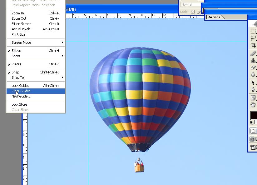
Hi Guys, This looks very much like a PhotoShop Guide Line? If so, it should appear on the original image when you pull it up in PhotoShop or your present choice of software. At least in PhotoShop you can get rid of it by clicking as indicated by the cursor arrow on the image below: Lin
-
Hi Igor, Dave, Thanks - that works well. I'm still experimenting but I think I have the hang of it. Igor, I was looking at the effects on the Star Wars trailers and I think you could get a closer approximation if you created the masks in a "Star" shape. As I look at their effects it seems instead of just a "spot" they are showing "star shaped" bursts at different points so if the "spot" mask had the shape of a star the effect would be almost perfect when added to what you already have. Lin
-
Hi Igor, I've been noticing that when I add text as an object at "0" rotation, it seems to be off by about one degree requiring a correction of approximately -1 degree (minus one degree) to get it horizontal. Am I seeing things or is there actually a slight 'off horizontal" for the default of zero degrees? After taking a better look - It's not P2E, it's PhotoShop CS which is importing the slight off horizontal because I see it there where I create the text - definitely NOT a p2e issue - sorry........ Best regards, Lin
-
That's a cool effect Igor! It seems there is no end to what can be done with objects when you have the versatility of P2E. Great job with this - there are going to be lots of people scrambling at the competition to try and catch up!! One effect I would like to be able to create but haven't been able to figure out how is the "Star Wars" text effect where the text scrolls up, but it appears to be lying back at about 30 degrees as if the lettering were tipped backward with the top being further away from the viewer. As it scrolls upward it gets smaller and appears to eventually disappear into space. The getting smaller and disappearing while scrolling upward is easy, but the effect of being tilted backward has me puzzled. Perhaps using PhotoShop or PixBuilder to "distort" a text block might work, or perhaps just purchasing some "perspective fonts"? Best regards, Lin
-
Ken, Why not put them (the two images) both inside a rectangle (group select) then apply the movement to the group? This will keep everything in sync easier I think. Though you "can" individually control elements within a rectangle, if you apply the effects to the rectangle itself the objects within will all take the identical actions. What you are doing with the gaussian blur can also be extended to other effects as I did with the "sunset" effect and the eagle flying. I used what began as identical images but modified the "copy" so the clouds had the sunset effect. Then I varied the transparency over time on each to effect a gradual change from daylight to sunset to darkness while simultaneously using the transparent background moon beginning with about 20% transparency to mirror a daylight moon and let it gradually shift to 100% opacity just before the end of the 36 second slide. Best regads, Lin
-
O.K., I posted this earlier but it's been moved down so I can't even find it - LOL - Anyway just a repost to help new users get started with Beta 5 - HTML tutorial on basics. It probably would be best to print this so you can follow along. http://www.lin-evans.net/p2e/index.html Lin
-
After looking at AL's (Robbins) mask, I decided to try a couple and I posted a link a few days ago to a file called "eaglezoom.zip". I got to thinking that with all the power inherent in P2E 5.0 beta 2 that I could probably simulate a scenario with early evening to sunset. I took a transparent background moon shot which I had created earlier, then I used a frame I took of a bald eagle soaring away from a perch and dupulicated it under a new name. I took the duplicate into PhotoShop and modified it to show an evening "sunset" sky and saved it to a new file name without changing any of the actual content - just the color in the clouds, etc. I loaded the original eagle soaring away frame and the transparent moon set to low opacity (20%) to simulate the appearance of the moon in early evening while still daylight. I set the time for the slide display to 36 seconds and zoomed out on the eagle set to a keypoint near the end of the show. I set the begining opacity to 100% for the eagle frame and inserted a keypoint near the end of the show set to zero % opacity for the main eagle frame. For the moon I set the opacity near the end of the show to 100%. So far this has the effect of a daylight shot of an eagle soaring away with a dim (very light) moon in the sky. Across the timeline the light slowly fades to black and the moon slowly becomes fully opaque as the sky goes dark. Next I added the duplicate eagle soaring frame which has the sunset and set the begining opacity to zero. At about the 15 second level I placed a keypoint setting the opacity to zero again. This keeps the effect from begining until that point so it doesn't try to gradually change to a blend in of the sunset before I wanted. Then I set another keypoint at about 22 seconds and set the opacity to 100% so that the sunset fully vests between the 15 second and 22 second periods. Then I set a finaly opacity to zero so that as the darkness falls the sunset diminishes accordingly. Finally there is three seconds of fully opaque moon with no eagle or other image. Here's the link to see the results: http://www.lin-evans.net/p2e/eaglezoom.zip Best regards, Lin
-
Looks good Ron, A couple suggestions. Lengthen the display time for the motion slide so as to slow down the ship coming in, then since it's already a png, add some slow rotation up then down, perhaps two 5 degree rotations up and two 5 degree rotations down to get the effect of the ship as it would normally ride in the water. With a little time you could probably also add some semi-transparent "splash" as the rotation goes hits "bottom" to give it a life-like effect. Best regards, Lin
-
Hi Jeff, Sounds like a good idea. I have about an 11 page tutorial on the web which I did the day after the beta was released. I haven't updated it to include the use of masks or some of the exotic capabiliies with 3D text, etc., but it's a start. After looking at it I decided that I need to recapture screen shots and use only one full screen then closeups of relevant parts because it's too difficult to see the tiny print in a full screen capture. Here's a link to what I have now: http://www.lin-evans.net/p2e/index.html