
thedom
-
Posts
2,323 -
Joined
-
Last visited
-
Days Won
6
Posts posted by thedom
-
-
Berny, when you talk about "templates and themes", do you refer to styles ?
And "crossfades" refers to transitions ? -
Thanks Alaina.
With photographs, I agree, I like slideshows with light animations to make something dynamic and entertaining.
I must admit that the movements of the 2nd animation were probably too wild.That's why I tried to change things to be enjoyable for everybody.
Here is a new demo with things modified for the 2 sequences previsouly published and with 4 brand new animations in the same spirit.
As usual, please let me know your thoughts. -
5 hours ago, Xenofex2 said:
I agree with the other comments. For me the last two felt like I was on a boat that was rocking side to side. Must admit that I am definitely not a sailor so perhaps not surprised to hear that I had to stop watching.
I will not provide vomit bags with the style!

Seriously, thank you for your feedback George.5 hours ago, Xenofex2 said:Now I do not know if this is a good idea or not. I tried to imagine where and how I would use the Style. Different places visited perhaps? So I know one could add text to the image before adding but just wondered whether I would also like a caption ability within PTE for each image. Just a thought.
I didn't show it in the demo but the polaroid style of the 2nd animation is exactly for that purpose, to add text at the bottom of each picture directly within PTE.
3 hours ago, MUR said:I agree with the comments, maybe some small breaks and smooth changes in the rotation, mainly in the first version.
In any case very good and not being extremely complex, they will be used more frequentlyThanks MUR. I will add slowdowns to soften things.
(the two sequences of the second animation are strictly identical, only with different pictures. May be you were used to the rollercoaster effect when watching the second one). -
2 hours ago, wideangle said:
Maybe slow things down a little and introduce a slight pause on an image?
Just my opinion, but a great effect, as ever, Dom.
Thank you Wideangle! And I like your idea!
I will try to make something with it. -
Thank you for your comment Frans.
I agree, I probably put the pictures too far away from each other, provoking too wide movements.
May be this sequence will be more appropriate for a dynamic slideshow (sport by example) ?
I will make the other sequences more calm. Thank you again. -
On 5/31/2020 at 12:43 AM, Aleina Show said:
Beautiful embodiment of the idea! You are great at creating 3D models in PTE!
Thanks Aleina. I think I would have loved to have a work in 3D design!
On 6/1/2020 at 5:51 PM, Alice said:Very creative idea, and I like how the cam approach the album, and the feeling of comfort created by the light of the windows... looks pretty nice, congrats
")
Thanks Alice. I fixed display issues and added some details that might increase this comfort feeling.
-
Here is a new animation of pics falling.
As my last productions, I tried to make something realistic.I already made two different sequences.
As you can see in this demo, the style will be for pictures in landscape and portrait orientation (whatever the format, 3:2, 16:9, 4:3 or square) and they can even be mixed.
I plan to make two or three other sequences in the same style.
Before continuing, please let me know your thoughts.
Thanks.
-
Bruno, Wideangle, sanpier, thank you for your comments.
-
43 minutes ago, jienense said:
One way to avoid this problem would be for the program to notify you that you are missing the name of the source.
Good idea, it would be great!
May be you could start a new post in the «suggestions for next versions » section ?42 minutes ago, petitsaxo said:OK merci c'est maintenant parfait
Thank you for your feedback, glad everything is ok.
30 minutes ago, henry64200 said:un Grand Merci Dom !!!! belle réalisation !!
Thanks to YOU for suggested me to make a new style with this famous sequence.
-
Nice Paul !
May be you could post your next styles in the Styles and Templates section.
This way, people will not miss them. -
4 minutes ago, Chris4137 said:
all is right now with the new font
Great, thank you for your feedback.
For those of you who didn't download the style yet, the 5th font is now included in the zip. -
10 minutes ago, Chris4137 said:
Après installation des 4 polices et application du style je rencontre ce problème - Pourquoi?
Thank you for your interest Chris.
And sorry for the inconvenience.
I think we posted our messages at the same time.
Here is the explanation of the issue (two messages above).
14 minutes ago, thedom said:Sorry guys, my mistake, I forgot to include 1 font in the zip.
Close your project and please install this 5th font.
Re-open your project. I think everything should be ok now. Is it ? -
31 minutes ago, petitsaxo said:
je pense que la police de caractère du second container pourrait être plus "lisible"
1 hour ago, Berny said:It looks like that I must mark 2 pictures and then choose the theme "Star Wars".
Sorry guys, my mistake, I forgot to include 1 font in the zip.
Close your project and please install this 5th font.
Re-open your project. I think everything should be ok now. Is it ? -
1 hour ago, Berny said:
It looks like that I must mark 2 pictures and then choose the theme "Star Wars".
Unfortunately, it looks like after the credits of the script, that the next picture (after the credits) is my 2 picture as in the Screnshoot.
Unfortunately I do not know whether I have explained this.
Greeting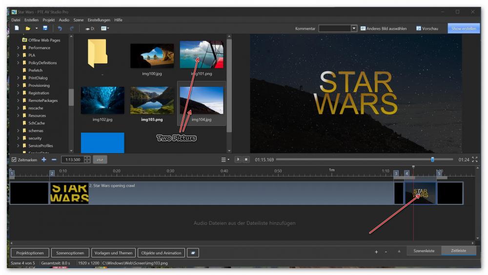
I am not sure to understand your issue Berny.
On the screenshot, I can see that there is at least two fonts not installed. As mentioned in the description, you have to install the 5 fonts included in the zip.
Please let me know how it turns after installation of the fonts.
-
2 minutes ago, petitsaxo said:
je pense que la police de caractère du second container pourrait être plus "lisible"
qu'en penses tu ?
On the screenshot, I can see that there is a font which is not installed.
Save your Pte project and close it.
reinstall the 4 fonts and reopen your project, it should be ok.
-
1 hour ago, petitsaxo said:
Excellent mais l'image de fin ne colle pas
en effet texte dans le second container ne donne pas l'effet escomptée sur votre vidéo
I don't understand what you mean.
Please upload your project or a screenshot of the issue. -
6 minutes ago, Berny said:
Sorry, but with your LInk always comes: Page not found
GreetingSorry Berny, my mistake, link modified, please try again.
Oops, and minimum price is 0€, not 5€. -
7 hours ago, MUR said:
Now the empire, my friend Darth and everybody knows about PTE AV Studio
Hehe
7 hours ago, sanpier said:Many thanks...I will be looking forward to this!
My pleasure!
I made minor changes (colors, glow, pace...). The style is now available on my website : http://gumroad.com/thedom
-
It's incredible to think that it took probably days or weeks to make this sequence in the 70's
And now it's so easy with PTE !Style available on my website HERE
-
I tried to make something very close to the original effect. I tried to give it a "cinematographic" look (not too "clean").
The style should be available tomorrow, eventually with minor changes.
Do not hesitate to make suggestions.Of course, you will have the ability to change absolutely all texts.
Two images of your choice will be used for the ending sequence (background image replacing Darth Vador and image replacing the one with all star wars characters displayed in your own text). -
You’re welcome George.
it’s not totally obvious to activate, the translation is not perfect, you don’t understand 100% but it really helps to gloabally get a precise idea.
-
Very good tutorial Bruno, you seem to be very talented to explain things.
I think it should be quite easy to understand with automatically generated english subtitles -
Excellent project to study and to learn. Well done !
-
5 hours ago, Lin Evans said:
Cool !!! I like it !!!!
Lin
Thanks Lin ! Always good to have feddback from someone like you who made and give so much to PTE
5 hours ago, nelson said:Love this idea. The ability to change the scene to fit ones own project would be great.
I have used your albums in the past and tried (although not very well) to use the book coming out of a book case or shelf in a bookstore from an area I travelled to in Ladakh as an opening sequence.
I hope you expand this idea further,
Kieron
Thanks Kieron.
Do you have precise ideas how to "change the scene" ?5 hours ago, nelson said:I have used your albums in the past and tried (although not very well) to use the book coming out of a book case or shelf in a bookstore from an area I travelled to in Ladakh as an opening sequence.
I hope you expand this idea further,
Great idea ! I could use this idea in the future and of course, to offer you the style (in case it's not free).
5 hours ago, nelson said:I am also curious if you will be re-visiting and updating some of your older templates, like the Handwriting with fountain pen, typewriter, and the Travel one that used a calendar.?
I like to do new things. So I'm not certain. But I had a new idea about the handwriting with the use of modifiers. SO why not...
2 hours ago, MUR said:Hi thedom
Very good animation, very accurate and as always, great handling of light and shadows.
MUR
Thanks Mur. Yes, I really spend a lot of time to adjust those light and shadows parameters to make the scene look "real" and give it volume.
2 hours ago, stranger2156 said:A great start to showcase your albums (reducing time a bit due to speed).
Paul
Thanks Paul. Yes, I agree, the pace is too slow, I will accelerate it in standard version. And for those who would like to accelarate or slow it down, they can play with the speed parameter of the style.

walk through the underground world
in Slideshows & AV Shows
Posted
Excellent way to present your pictures !!
Here are some suggestions to make it look even better (some of them are personal tastes) :
- give thickness to the frames at the beginning (on the right wall and the left wall)
- align correctly the angles of one of the frame (bottom left if I remember correctly)
- There is no necessity to unhook the frames from the wall, it looks strange to me
- standardize the frames and use larger images because they are a bit blurry. Personaly, I don't like edging, it is not modern in my opinion.
- lighten the walls I find them too dark
Just ideas, it's really good as it is.