
thedom
-
Posts
2,323 -
Joined
-
Last visited
-
Days Won
6
Posts posted by thedom
-
-
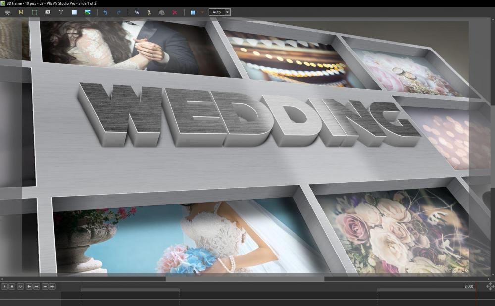
An other example of 3D text.
Work in progress
-
Depth feature would be great and that’s the user friendly solution we need
for now, if you have time and want a better result, the layers can be multiplied : instead of 1 layer for each increment on the Z axis, you can put 2 or 3 Layers.
-
Thank you Tom.
if you want to upload your own pics (two or three), I would be happy to make an exe for you with the two versions of zoom for each pic.
-
Thanks for sharing this Denis. I downloaded your slideshow.
Access to your « how to » is allowed only to members.
I hope there is no misunderstanding with this 3D text topic.
I do not claim to be the creator of this technique within PTE.
What I can say is that this is something that I have been trying to do for a long time (see this video from 2009 with a clumsy first attempt). I realized it was possible to have a much nicer result by chance without knowing somebody else did it.I had to stop using PTE and visit this forum for about 8 years for health reasons. Thanks to confinement (!) I got over it.
During all these years, I imagine that many new things have been created with new versions of PTE.
My goal today is really to share with the community, exchange tips and have fun together. -
Hi Bruno, great, I love the idea!
I have a suggestion with your 2nd capture. In my opinion, for something realistic, the photography should bend the opposite way (to the top instead of bending to the bottom).
Anyway, I am very curious to see the result and hope you will succeed to make what you want. -
Thanks Aleina.
I noticed that when I finish something in the evening and watch it the next day, I see it with an other eye and want to improve it because I see all the defaults.
Or it's a good thing for me to make a pause with a project for a week or two and resume it with a new frame of mind and new ideas because, without realizing it, my mind kept thinking about it. -
3 hours ago, MUR said:
3D text?
Hehe, that’s exactly the same method I used.
If you don’t think it looks like 3D, how would you call it ?Henry, Bruno, thank you. It’s only an example to illustrate what one can do. With work, imagination and correctly used, Igor and his team really gave us everything we need to make interesting and creative things.
-
3 hours ago, JRR said:
Your suggestion of opening the book "in the middle" would work quite well
That’s the option I choosed for my photo album and I had no comment about it, probably meaning it is acceptable.
-
On 6/7/2020 at 12:21 PM, Ronniebootwest said:
How do I download this style please?
Ronnie, could you download the style ??
-
I totally agree with this suggestion. And I would like 3D text too !
You might be interested in my experiment.
It's a workaround too but it gives good result : -
I red this topic in the suggestion section a few days ago about text outlines :
I totally support the idea.
And it gave me the idea to try to implement 3D text directly in PTE with of course the ability to put his own text and choose the font of his choice, color, texture, etc...
Here is a demo with a reference to a famous trilogy of the 80’s... -
I released a first version of this volumetric zoom a few weeks ago (see this topic)
I continued to work on this effect and made a V2. Of course it's still not perfect but the same parameters are applied EXACTLY the same way for all images in the demo to make something that can work Ok all the time.
What do you think ?I will try to transform this effect into an interesting style. Still have to think about it...
-
Thanks Aleina ! The comments really helped to improve it.
The styles are now available on my website for those of you who might want to purchase it : http://gumroad.com/thedom -
For text effect, the same text is often used 2, 3, 5 times... or even more !
It would be great if we could have "main text" feature (like for image objects) refering to the same text.
When we change a text, all texts refering to the same main text would be changed, instead of having to type the same text for each text object.
It would be a really useful feature for styles ! -
And for transitions, right click on the transition and choose "change transition settings".
You can choose an existing category in the dropdown list or create a new category. -
Berny, for styles, right click on the style and choose "change slide category".
You can choose an existing category or create a new one. -
Hi Jill, I tried some options but unfortunately without success (project options and slide options)
I would like to know if it's possible. -
2 hours ago, Ronniebootwest said:
How do I download this style please?
Ronnie, if still needed, here is a direct link to download the style : https://gumroad.com/thedom?sort=newest#qQQeG
-
Hi Azmi, thank you for your interest.
actually the style is already avallable on my website for 3 weeks under the name « flap » style.
Http://gumroad.com/thedom -
-
Wow, so much work, so many animated details ! Great great sequence.
I have a few suggestions :
- do not use “curved” ill image for the pages on the left (see capture), parallell line to the bottom of the book will look better in my opinion (or curved in the other direction)
- try to fix the little glitch in the middle of the book when camera goes on the left side of the book
- try to soften some movements of the camera, some of them are a little bit abrupt sometimes
- if it’s possible to add more variety in the angles of camera, it would be niceanyway, congratulations for this excellent animation.
Ps : Do you work in the kids sector ?
-
1 hour ago, wideangle said:
Dom
For me, the details that you have tweaked have made a difference, and I think the results are a good step forward.
I really like the sliding effect as the photographs land on the surface - it is very realistic.
Congratulations.
Regards
wideangle
Thanks wideangle! It’s a sum of little details not necessarily obvious, sometimes almost imperceptible that make it realistic.
-
1 hour ago, nelson said:
Really enjoyed the second video. I am always looking for ways to showcase my photos before I present my main shows while the audience is gathering.
The variations available would allow me to choose, and I am looking forward to the finished set.
Great work as always,
Kieron
P.S
Waiting patiently for your finished book styles.
Thanks Kieron!
I spend so much time on the photo album styles that I needed to make a pause. But you can count on them in 1 or 2 weeks.
-
2 hours ago, mhwarner said:
Hi Dom,
I much prefer the styles in your second video. I had comments much the same as others here after watching the first video, but you seem to have addressed most of them. My only comment on this last one would be the background movement in the 3rd sequence (with the polaroids with the text labels) is that I find the movement of that background annoying. I find moving the background slowly up or down or sideways less distracting. These styles are a great step up from your "photospile" template offered a few weeks ago. I hope we will have the option to use our own background -- even a blurred image would be nice too.
You really have an incredible imagination and the skill to be able to translate your ideas into finished works of art.
Mary
Hi Mary, thank you very much for your detailed comment!
I am not sure to know which animation you’re referring to (the one to you find annoying) because the animation with the text labels are the 2nd and the 5th one. Anyway I will release all those animations in a single styles package, people will have the choice to use the one(s) they like.
And yes, you will have the option to use you own background. And I will include a dozen of backgrounds you can choose from in the pack as well.

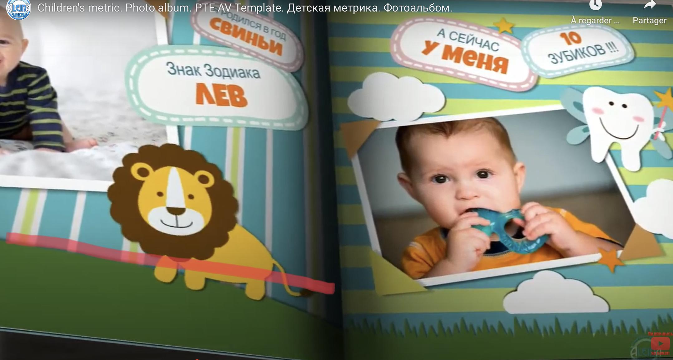
Children's metric. Photo album
in Slideshows & AV Shows
Posted
Beautyful and very tasteful !
Thank you for sharing.