Search the Community
Showing results for tags 'Suggestion'.
-
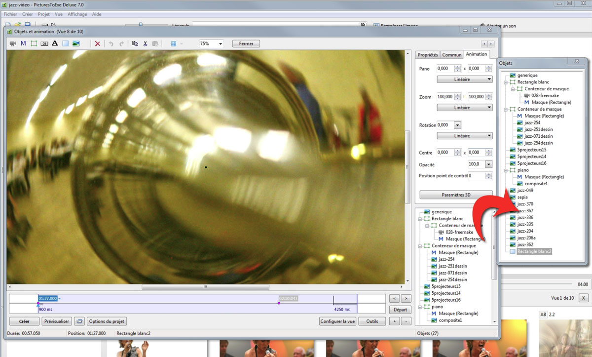
Suggestion : When using many objects, the Objects window is often too small, depending on the screens ... How about a pallet like this? It would be very useful for small screens and when working with two screens Charlie

-
Here are some suggestions that could make working with timelines for multiple layers much easier and more efficient. These suggestions build upon the existing software architecture, which is easy because PTE has a good foundational design. I just retired from working as a software designer and programmer and have seen many times the striking effects of improvements like this. The basic strategy is to have one active timeline as currently occurs, but also display timelines for selected other layers or objects. For ease of communication, I’ll use the term layer for any object or row in the object list on the lower right of the O & A screen. Certain methods would allow easily switching to a different active layer and aligning keypoints across layers. On the O & A screen, the timeline area at the bottom would be expanded to show up to 6 timelines. The lines for the timelines could be fairly close together and the times would not be permanently displayed for each keypoint as they are now (or time could be displayed on only the active timeline). There would be a time axis at the bottom with ticks every .25 seconds. The actual layers that are displayed in the timeline area would be selected by adding checkboxes to the objects list that is currently displayed on the lower right of the screen. For each layer or row, a checkbox would be present. By default the checkbox is blank. If the checkbox is checked, the timeline for the layer is displayed in the timeline area. Up to 6 layers can be checked. The displayed timelines would be numbered from top to bottom in both the timeline area and the objects list and would be in the order found in the objects list. If a layer that is not checked is selected by clicking on the layer name in the objects list, then only that one layer will be displayed in the timeline area. If no layers are checked the system would basically operate as it does today. The user who only wants to pan and zoom an image would not have to see or work with multiple timelines. The single timeline that is active could be selected by clicking on one of the timelines in the timeline area or by clicking on the layer name in the object list as currently happens. The image displayed would be for the selected active timeline as is current practice and the active timeline row would be highlighted in the timeline area as well as on the objects list. On the displayed timelines, a keypoint would be indicated by a dot (as it currently is) if there is no other displayed keypoint at that time. If there are one or more other displayed keypoints at that time, all the keypoints at that time on different layers would be indicated by a square rather than a dot. A keypoint could be moved by dragging the dot or square. If the Alt key was held down while a square keypoint was being dragged, all the other displayed keypoints at that time would be moved in synch. When the mouse pointer is held over a keypoint, moving the mouse scroll wheel would cause the keypoint or keypoints to move left or right with fairly fine resolution for precise alignment. If the mouse pointer is over the image display, then the mouse scroll wheel will zoom the image size. As a keypoint is moved, round keypoints on other layers would become squares as the moving keypoint aligned with them. Stopping would allow permanent alignment and continuing to move would result in the keypoints becoming dots again. Similarly, a moving round keypoint would become square as it aligned with another keypoint. As the mouse pointer is held over a keypoint, the exact time of the keypoint and time duration from the keypoint on the left would both be displayed. A system option would determine whether the time displayed for a keypoint is relative to the beginning of the slide or the beginning of the slideshow. Or, perhaps both times could be displayed. When any location on the active timeline is clicked, the right mouse button would include the option to insert or remove time at that point. A box to input the amount of time would be displayed. The time would be added or removed immediately to the right of the clicked point. The overall duration of the slide would be changed by the specified amount of time and keypoints on all layers (including those not displayed) would be shifted accordingly without changing the times between keypoints except at the location of the time insertion/removal. If the removed time includes any keypoints on any layer, a warning message would display and notify the user that keypoints are in the removed area and they will be shifted to the cut point (they would not be deleted). The option to cancel the time change would also be available. The Animation tab would have two checkboxes added in the zoom, pan, and rotate area. The boxes would be something like “Same as Left” and “Same as Right”. These would indicate and can set whether the zoom, pan, and rotate settings are the same as on the adjacent keypoints to the left and to the right. These boxes would be updated if changes are made later to the adjacent keypoints. System options would determine whether the default type of animation speed for a new keypoint is linear, smooth, etc. and the default would be separate rather than glued. The above would be the basic features. The maximum number of timelines displayed could be more or less than 6 depending on how much space is needed for displaying the image. When trying to imagine how this will work, keep in mind that it will be very easy to switch which timelines are displayed and to use one or two timelines as a model for transferring changes to other groups of timelines. - - - - - - - - - - - - - - - - - - - - - - - - - Additional options that could be added initially or at a later time are listed below. Holding down the control key while dragging a keypoint would cause all the other keypoints on the timeline in the direction of motion to shift while keeping the same times between keypoints (except for the keypoint on the very end). The duration of the slide would not be changed. Holding down both the Alt and control keys would cause all keypoints on all displayed layers to shift in the direction of motion. If a timeline is displayed that should not be moved, click the checkbox to remove the layer from display, move the keypoints for the remaining layers, and then check the box to bring back the other layer. Three checkboxes could be displayed somewhere on the screen to control display options. These would be: - Time Markers: checking this box would make vertical thin or dotted lines display up through the timelines on every .25 second tick. - Connections: checking this box would make vertical thin or dotted lines connect the square keypoints. - Snap: checking this box would make movement on the timelines snap to .25 second increments. The number of timelines that could be displayed in the timeline area could be increased and include scroll bars for larger displays. I’m not sure if this will be needed. It may be that 6 timelines will be about all that people need or can handle, or it may be that some people will want to display all the timelines. I would suggest seeing how 6 work first but programming in a way that anticipates possible expansion. A few options that are more sophisticated and challenging to program (but are becoming routine for Adobe products) are: - Allow the user to drag a rectangle that selects keypoints on one or more of the displayed timelines and shift the entire block without changing the relative timing of keypoints within the block. - If the mouse pointer is in the timeline area but not on a keypoint, then the mouse scroll wheel will zoom or expand the resolution of the timeline and scroll bars will appear. A slider could also be used to expand the resolution of the timeline. - If a large number of timelines can be displayed at once, allow the user to drag a line separating the image display and timeline area to change the relative size of the image and timeline areas. - Allow the user to add time to the slide by holding down the control-alt-shift keys while dragging the mouse on the active timeline. The location and amount of time added would be displayed real-time based on the amount of dragging. Time could be removed by dragging the mouse to select an area on the active timeline and then having a remove option on the right mouse button. The time changes would apply to all layers and warning would be given if keypoints are in an area to be removed.
-
 Hello! Thanks for the great program ! One suggestion : bold names for slides included in show. Now, only slides included as is in the show have bold names in list, but there is no indication when the slide has been included in a mask. Thanks ! Dan
 -
Hi @ll!
-
Regarding the constant problems with PTE shows and virus software, I would like to propose an additional way for exporting shows: I would think of something like a (zipped?) folder with a data container, a player-exe, and perhaps a configuration file. In this case, the player-exe will always be the same application, and it could be signed by WnSoft. Regards, Xaver
-
Igor I am sure I am not the only one to have noticed this, but on flat screen monitors a fade up from black can display some odd things on screen. I am not sure what to call the effect, but its not very attractive. I think its on par with the moire effect. It seems to be worse fading up onto a monochrome image. Is there anything that can be done about that. I have tried moving away from black to a dark charcoal colour and adding noise, but I would rather stay with black.
-
Since we already create a zipped MacIntosh format as an option, and since almost everyone who uses PTE zips their executable files to send them to Beechbrook or to put them on their own website with a link, why not include both the EXE version "and" a zipped version containing the PC version of the EXE file as an option? It would greatly facilitate and save a lot of time. Lin
-
In the part "animation" can adjust opacity. It seems to be interesting to also adjust the blur. Is this provided in a furure version?
-
 Adding "Picture(s)ToExe" to RightClick of all windows is really necessary !
 -
please Add "New project (*.pte)" in the right click of all windows right click for windows xp , vista ,…
-
I see a problem with the so-called "Mode" option "Fit to slide"/"Cover slide". It appears to be accessible only in Objects and Animation, in the Common tab. As only one slide at a time can be amended in O&A, changing the Mode for every slide is a tedious business. May we please have a Project Option to choose the desired mode, so that every slide inserted into the Slide List can have the specified mode? Much time and many mouse-clicks could be saved! Ken T (APLman)
-
An image in a slide can be placed according to the chosen mode (Fit To Slide or Cover Slide). I have already suggested that we need a Project Option for that choice, so we don't need to set the Mode for each slide separately. Some users want to fill the slide space (losing a bit of image), others want to see the whole image (even if it does not fill the screen). Similarly, I see a definite need for a Project Option to control the placement of video clips - not spacially, but with regard to time. My video clips will usually be placed between static image slides, and I don't want my video motion or sound to start until the previous transition has completed. I want my whole video clip to be seen, not partly obscured by the transition. The present state of version 7 apparently always places a video clip to begin at the start of the incoming transition. My preference would always be to have the transition completed before the video clip begins. Therefore, may I please request a Project Option to allow that choice to be made one time only, and to apply to all video clips inserted? I believe it would be easy enough for Wnsoft's programmers to use the first frame of the video in the preceding transition, and the last frame in the next transition. That's the way I would like to work - always! Ken T (APLman)
-
On the main page in Slide View, add a tiny animated mini-preview of the existing transition. Enable the ability to Right-Click on the tiny transition preview to quickly select the desired transition from a fly-out list. Presently, slide transitions are attached directly to a specific slide. Developing a slide show would be more intuitive if we thought of the transitions as an effect apart from the slide and between the slides. If anyone agrees, can you word this to make it more clear? Thanks JK
-
From what I can see in the forum, I think there are plans to address this general problem, but I wanted to add my thoughts. I think that the current all-or-nothing for the video clip's audio is a severe limitation when dealing with people's voices in video clips. While I can work around it by using an external sound editor, that would require re-working any time the video clip's location changed. I think a good start (and hopefully easy to implement) would be to offer the following options in the O&A for a video clip: - "percentage loudness" for the PTE audio track and the video's audio track. 100% would mean that they are each mixed at full volume and the PTE audio track volume is unchanged from the previous slide. Values more than 100% should be allowed, particularly for the video's audio track. - "fade in time" for each of the PTE audio track and the video's audio track. If this is non-zero, it would be the time at the beginning of the object's presentation where the respective volume is changed from 100% to the number specified above. - "fade out time" for each of the PTE audio track and video's audio track. If this is non-zero, it would be the time at the end of the object's presentation where the respective volume is changed from that specified above to 100%.
-
Igor, Sometimes, I like to use pan and zoom to give the presentation a kinetic feel. When doing that, it is often important to keep the "speed" (for lack of a better word) of the zoom pretty much constant from slide to slide for a series of slides. Today, the only way I know how to do that is by trial and error, or by using numeric computations based on the zoom numbers, which can be pretty tedious. So it occurred to me that PTE is running on a computer, and why couldn't I ask PTE to do it for me? This is my dream, and I am going to use words to express it that might not make much sense to you, since you know much more about video than I do. But I am going to try <s>. Suppose I want to do a sequence with the "camera" slowly moving "forward" at a constant pace ("speed"). As it does that, I want to fade or cut from one picture to the next. So what I want to do, when looking at two keypoints, is set the size and place of the picture for one of them, and then tell PTE how "fast" I want to zoom in ("move forward"). Then I want PTE to calculate the size and place of the picture on the next keypoint that will generate that "speed". I also want it to keep the speed number around so I can change it a bit (make it faster or slower) and recalculate the specs for the next keypoint. When I move a keypoint, I am certainly willing to press a button to recalculate, although if you have hot-linked the two keypoints together, and it happens automatically, that would be great. Zoom seems like it might be somewhat straightforward, since I can zoom in and out. But I think this might also be a good idea for pans, and it seems to me that for pans, I would have to give a direction in addition to speed. To generalize this, and allow both zooms and pans to happen at the same time at a constant "speed", it seems like I want to give PTE a "direction" in some kind of "3D way" that tells it how I want to move, and then also specify how fast, and let it figure out where I will end up on the next keypoint. I've not given this much detail implementation thought, since I have no idea whether something like this might be at all possible. But I'd love to have the ability to do this kind of presentation with less tedium than it would take to do it now. H
-
Igor I wonder if this is something you could consider for the future. I like to use the option to add blanks to my slide shows, but I find computer generated colour, (other than back and white) unnatural to the eye, it's too smooth. I would like the ability to add Gaussian Monochrome noise to blanks or Rectangle shapes in the O&A, maybe even textures if that is possible. Ideally, I would like the same opportunity to do that to the colour behind the slides and also the colour outside the slide area. If I am not pushing my luck too far, I would also like to be able to affect the colour/Noise outside the slide area in the Customised slide option too.
-
?
-
Hi, I find that in the 'new' Project Options, the box to set the 'aspect ratio' has moved to the Main tab and the box to specify the 'virtual pixel size' has stayed on the Screen tab. I much preferred it when the two were together and I could set my ratio and pixel size at the same time and make sure that they were compatible without toggling between the two tabs. I suppose that there must have been a good reason for the change but is there any possibility that they could go back to being on the same tab, please? Regards, Sheila G
-
 Igor, Suggestion: In the Video "Trimming" window in Objects and Animation please add a button to: Set TRIMMED DURATION OF VIDEO as "Duration of Slide". It would then be easier to click on a button than to have to open Customise Slide and transfer the DURATION figure manually. Thanks DaveG
 -
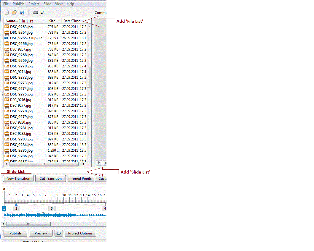
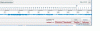
Can I suggest a new layout for the main window, which combines both the Slide & Timeline View. When making a sequence I spend an awful lot of time going back & forth between the Slide List & Timeline. It would be really helpful to see both at once. Also now that the Slide/Timeline Button(s) have been moved over to the right it is not as easy to switch views. The original button in v6.5 & prior was in a convenient place roughly in the centre of the screen. Also it was only one button so you could leave the Mouse over it & just click. Now you have to keep moving. I know you can press F6 & for those of us used to computers that is ok. But for newcomers who can only type with one finger & have to keep letting go of the mouse to use the keyboard it is much more cumbersome. This new layout has the advantage of being able to see everything at once. You can quickly use the Slides to move images or add new ones. And also use the Timeline to adjust durations etc. I would also suggest that the Slide duration (bottom right of each slide) is set to the actual screen time so that it is consistent with the view below. As the images may not line up with the times below, could they be automatically scrolled? Say keeping the current image/time central. And something I forgot to include in the picture above. PLEASE bring back the buttons for Fullscreen view of File List & Slide List Jill
-
 I thought I'd posted this earlier some weeks ago, but I can't find it now so I thought I'd re-post one idea and add a related one. I really appreciate being able to hear music in the O&A window during playback, but it would also be nice if there could be a display of that portion of the waveform at the bottom of the window. This would both help fine-tuning control points to events in the sound track, and also (see below) the waveform could be used to provide reference points for the timing of control points for some objects. Failing that, or in addition, it would be nice if one could see the timeline(s) for at least one other object when working on the control points for a different object. I often find myself wanting to time the actions of one object in relation to control points for another object. This isn't always easy to do just using the preview window; if I could see the timeline of at least one other object than the one I'm working on, it would be much easier and quicker to coordinate the control points for the two objects. for example, if one wants to fade down one object while fading up another, but with a bit of an offset on the timeline. I realize that we don't want to clutter the display with too many timelines, which might get to be pretty confusing once the number of objects involved gets much above two or three. But providing even just one timeline other than the one for the object currently being worked on, could help, especially if one could designate which object's timeline would be displayed from among those in the objects list. If adding both the waveform and a second timeline would be too much, then my preference would be for the waveform. If necessary, before switching between objects I could try to find a specific reference point or "spike" on the waveform and use that to help position control points for the timeline of a different object. Of course one can always write down the keyframe times for specific reference points and use those to help place control points on a different timeline, but it would be easier either to use the waveform for reference or better yet have at least one other designated timeline displayed for reference, and do the linkages visually rather than numerically. I hope I've worded this clearly enough This is not a "critical" issue for me, but it would be nice to have these features.
 -
One of the most professional looking features of a PTE presentation used to be the ability to have a gentle fade down from the desktop to the first (BLANK) slide. And at the end of the last (BLANK) slide in the sequence, it was possible to specify a similar gentle fade back to the desktop. This gave a very professional looking feel to the whole show, and is the reason why some of us stick to version 4.48. This feature disappeared for some reason from version 5 onwards, to be replaced by a FLICKER CRASH BANG WALLOP effect at the start of every sequence, which is most unpleasant. I really feel this should be a priority for the developers to get right in the next update.
-
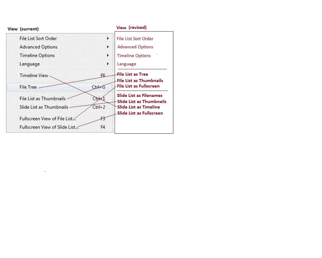
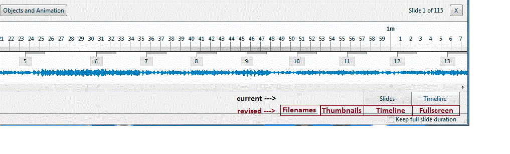
Clarification of Menu Items: I have been using PTE for a number of years. The View menu structure has always been a bit odd to me. I finally have figured out why it has been a bit of a struggle to understand it. I am suggesting some changes to make it more intuitive. First, there are basically two menus: a File List and a Slide List. I suggest that these two menus should be titled in the main screen. See the attached Menu Screen-1.gif. Secondly, revise the View menu to reflect this. This revised View menu consolidates all of the File List view choices and the Slide List view choices. See the attached View Menu.gif. Thirdly, to reflect the four Slide List views (Filename, Thumbnails, Timeline and Fullscreen), I suggest that each choice be reflected in the main screen. See the attached Main Screen-2.gif. I think these changes will remove some confusion and make the menus more intuitive. Gary
-
Please tell me if this has been raised before and I'll delete the thread? In the O&A window it would be great to be able to see the next image appearing during the "outgoing transition". It would make alignment of images for the "third image" effect so much easier. Anyone have any views? DG
-
Igor A couple of thoughts that came to me while using PTE today. 1. I would love to be able to click and drag the grey transition bars inside the Objects and Animation screen to alter the in and out transitions 2. To be able to see the effect of the transitions when the Play button is clicked in the Objects and Animation screen 3. To be able to turn off objects, again in the Objects and Animation screen, so they are temporarily invisible and not selectable. (until turned on again) 4. To be able to highlight more than one keypoint to move them along together in the O&A 5. I have raised this before, but seeing as I am talking exclusively about the O&A I'll repeat it here. To have the objects section looking like photoshop, with a thumbnail of the objects and the facility to drag and drop up and down the stacking order. Please, no replies about work arounds, these are just ideas for Igor to consider.